Bootstrap Carousel
Introduction
The slider carousel is a slideshow for cycling into a variety of images, text, video built with CSS 3D transforms and a bit of JavaScript. It coordinates with a number of pics, text message, or custom made markup. It additionally incorporates support for previous/next commands and indications.
How to use Bootstrap carousel:
All you need is a wrapper element with an ID to contain the whole carousel element carrying the .carousel and additionally – .slide classes (if the second one is omitted the images will just change without the nice sliding transition ) and a data-ride=”carousel” property in case you want the slideshow to automatically start at the page load. There should also be another element inside it carrying the .carousel-inner class to contain the slides and finally – wrap the images into a .carousel-inner element.
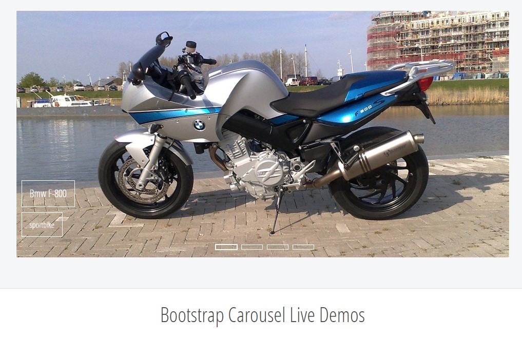
Some example
Slide carousels really don't promptly stabilize slide dimensions. You may have to use extra utilities or possibly custom varieties to appropriately size material. Even though carousels uphold previous/next regulations and indicators, they are actually not clearly needed. Put in and custom as you see fit.
Make sure to set up a unique id on the .carousel for optional directions, most especially in case you're working with several carousels upon a single page.
Only slides
Here's a carousel together with slides only . Bear in mind the presence of the .d-block and .img-fluid on slide carousel pictures to prevent browser default pic arrangement.

<div id="carouselExampleSlidesOnly" class="carousel slide" data-ride="carousel">
  <div class="carousel-inner" role="listbox">
    <div class="carousel-item active">
      <div class="img"><img class="d-block img-fluid" src="..." alt="First slide"></div>
    </div>
    <div class="carousel-item">
      <div class="img"><img class="d-block img-fluid" src="..." alt="Second slide"></div>
    </div>
    <div class="carousel-item">
      <div class="img"><img class="d-block img-fluid" src="..." alt="Third slide"></div>
    </div>
  </div>
</div>
Also
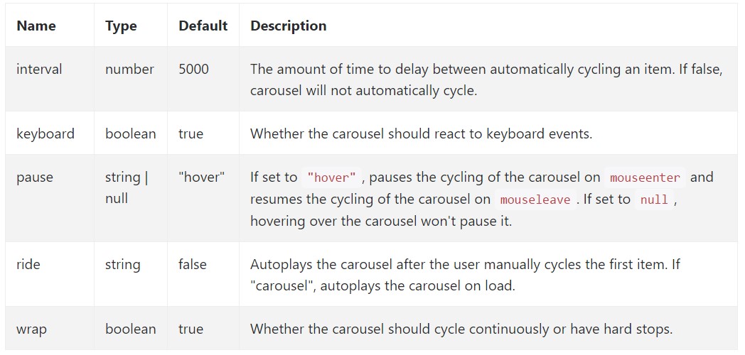
You can also set the time each slide gets displayed on page by adding a data-interval=” ~ number in milliseconds ~ ” property to the main .carousel wrapper in case you want your images being seen for a different period of time than the predefined by default 5 seconds ( 5000 milliseconds ) interval.
Slideshow using controls
The site navigation between the slides gets done by defining two link elements with the class .carousel-control and an extra .left and .right classes in order to pace them accordingly. As target of these should be placed the ID of the main carousel element itself and some properties like role="button" and data-slide="prev" or next.
This so far comes to assure the controls will work properly but to also make sure the visitor knows these are there and knows what they are doing it also is a good ides to place some <span> elements inside them – one with the .icon-prev and one – with .icon-next class along with a .sr-only telling the screen readers which one is previous and which one – next.
Now for the essential part – placing the actual images which should take place in the slider. Each image element should be wrapped inside a .carousel-item which is a new class for Bootstrap 4 Framework – the previous version used to utilize the .item class which wasn’t so much intuitive – I guess that’s why now it’s replaced.
Incorporating in the previous and next regulations:

<div id="carouselExampleControls" class="carousel slide" data-ride="carousel">
  <div class="carousel-inner" role="listbox">
    <div class="carousel-item active">
      <div class="img"><img class="d-block img-fluid" src="..." alt="First slide"></div>
    </div>
    <div class="carousel-item">
      <div class="img"><img class="d-block img-fluid" src="..." alt="Second slide"></div>
    </div>
    <div class="carousel-item">
      <div class="img"><img class="d-block img-fluid" src="..." alt="Third slide"></div>
    </div>
  </div>
  <a class="carousel-control-prev" href="#carouselExampleControls" role="button" data-slide="prev">
    <span class="carousel-control-prev-icon" aria-hidden="true"></span>
    <span class="sr-only">Previous</span>
  </a>
  <a class="carousel-control-next" href="#carouselExampleControls" role="button" data-slide="next">
    <span class="carousel-control-next-icon" aria-hidden="true"></span>
    <span class="sr-only">Next</span>
  </a>
</div>
Using indications
You can easily add the indications to the slide carousel, alongside the controls, too
Inside the main .carousel element you could also have an ordered list for the carousel indicators with the class of .carousel-indicators with some list items each one carrying the data-target="#YourCarousel-ID" data-slide-to=" ~ appropriate slide number ~” properties where the first slide number is 0.

<div id="carouselExampleIndicators" class="carousel slide" data-ride="carousel">
  <ol class="carousel-indicators">
    <li data-target="#carouselExampleIndicators" data-slide-to="0" class="active"></li>
    <li data-target="#carouselExampleIndicators" data-slide-to="1"></li>
    <li data-target="#carouselExampleIndicators" data-slide-to="2"></li>
  </ol>
  <div class="carousel-inner" role="listbox">
    <div class="carousel-item active">
      <div class="img"><img class="d-block img-fluid" src="..." alt="First slide"></div>
    </div>
    <div class="carousel-item">
      <div class="img"><img class="d-block img-fluid" src="..." alt="Second slide"></div>
    </div>
    <div class="carousel-item">
      <div class="img"><img class="d-block img-fluid" src="..." alt="Third slide"></div>
    </div>
  </div>
  <a class="carousel-control-prev" href="#carouselExampleIndicators" role="button" data-slide="prev">
    <span class="carousel-control-prev-icon" aria-hidden="true"></span>
    <span class="sr-only">Previous</span>
  </a>
  <a class="carousel-control-next" href="#carouselExampleIndicators" role="button" data-slide="next">
    <span class="carousel-control-next-icon" aria-hidden="true"></span>
    <span class="sr-only">Next</span>
  </a>
</div>
Include a number of underlines in addition.
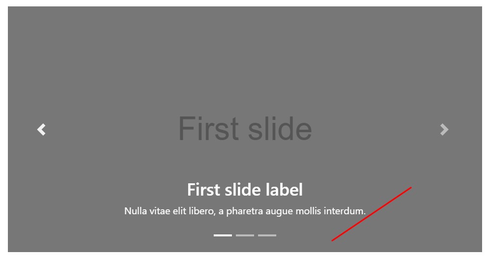
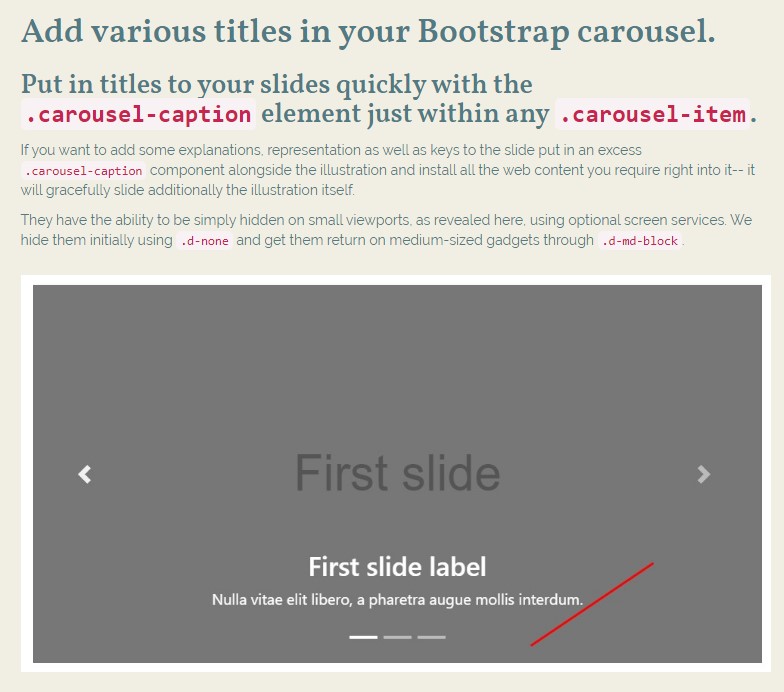
Incorporate captions to your slides efficiently through the .carousel-caption element within any .carousel-item.
In order to add some captions, description and buttons to the slide add an extra .carousel-caption element next to the image and place all the content you need right inside it – it will gracefully slide along with the image itself.
They can surely be efficiently covered on a smaller viewports, like revealed here, utilizing extra display screen services. We conceal them at the beginning with .d-none and deliver them return on medium-sized tools with .d-md-block.
<div class="carousel-item">
  <div class="img"><img src="..." alt="..."></div>
  <div class="carousel-caption d-none d-md-block">
    <h3>...</h3>
    <p>...</p>
  </div>
</div>
More secrets
A cute trick is when you want a link or a button on your page to lead to the carousel but also a particular slide inside it to be visible at the time. You can actually do this by assigning onclick=" $( ' #YourCarousel-ID').carousel( ~ the needed slide number );" property to it. Just make sure you’ve considered the slides numbering actually starts with 0.
Treatment
By using information attributes
Utilize data attributes in order to easily deal with the placement of the bootstrap carousel .data-slide accepts the keywords prev or next, which in turn alters the slide setting relative to its own present position. Additionally, utilize data-slide-to to pass on a raw slide index to the bootstrap carousel data-slide-to="2", that moves the slide location to a specific index beginning with 0.
The data-ride="carousel" attribute is taken to identify a slide carousel as animating beginning at webpage load. It can not be utilized in combination with ( unnecessary and redundant ) specific JavaScript initialization of the same bootstrap carousel.
Using JavaScript
Call slide carousel by hand having:
$('.carousel').carousel()Options
Solutions can be completed by using data attributes or JavaScript. Regarding data attributes, attach the option name to data-, just as in data-interval="".
Ways
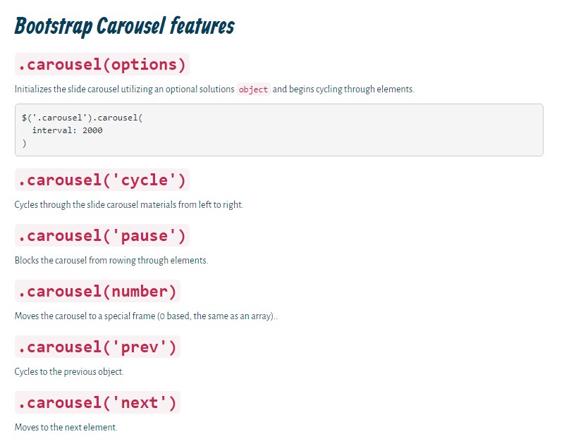
.carousel(options)
Initializes the slide carousel through an optionally available solutions object and starts cycling through the elements.
$('.carousel').carousel(
  interval: 2000
)
.carousel('cycle')
Cycles through the bootstrap carousel elements from left to right.
.carousel('pause')
Holds back the slide of bootstrap carousel from rowing through objects.
.carousel(number)
Cycles the bootstrap carousel to a certain frame (0 based, the same as an array)..
.carousel('prev')
Moves to the prior element.
.carousel('next')
Moves to the next thing.
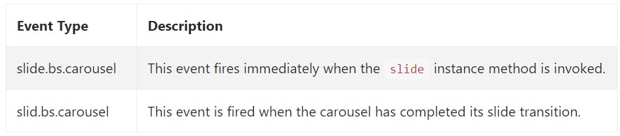
Events
Bootstrap's slide carousel class exposes two occurrences for connecting into bootstrap carousel capability. Each of those activities have the following additional properties:
- direction: The direction in which the slide carousel is sliding (either "left" as well as "right").
- relatedTarget: The DOM feature which is being moved right into location just as the active item.
All of the slide carousel occurrences are launched at the slide bootstrap carousel itself (i.e. at the <div class="carousel">).
$('#myCarousel').on('slide.bs.carousel', function ()
  // do something…
)
Conclusions
So basically this is the way the carousel element is structured in the Bootstrap 4 framework. It’s really simple and straightforward. Nevertheless it is quite an attractive and convenient way of showcasing a lot of content in less space the carousel element should however be used carefully thinking of the legibility of the message and the visitor’s comfort.
Too much images might be missed to be seen by scrolling down the page and if they slide too fast it might become hard actually seeing them or read the texts which might eventually confuse or frustrate the page viewers or an important call to action might be missed out – we sure don’t want this to happen.
Who doesn’t love sliding images with some cool captions and text explaining what they mean, better relaying the message or why not even better – also having a few buttons along calling the visitor to take some action at the very start of the page since these are usually placed in the beginning. This has been taken care of in the Bootstrap framework with the built in carousel element which is fully supported and quite easy to get together with a clean and plain structure.
Check a couple of on-line video guide about Bootstrap Carousel:
Connected topics:
Bootstrap Carousel main information
Bootstrap 4 Сarousel issue
jQuery Bootstrap Carousel Slider
HTML Bootstrap Image Carousel Template

jQuery Bootstrap Carousel Example
Responsive Bootstrap Carousel with Swipe
Bootstrap Image Carousel Example

HTML Bootstrap Image Carousel with Video

jQuery Bootstrap Carousel with Swipe
jQuery Bootstrap Image Carousel Slider
Best Free AI Website Builder
Generate AI websites with a simple prompt!
Type in any language, export in zip.
Best Free Website Builder Software
Create awesome websites offline!
No coding. 9900+ templates.
Edit and save locally, upload wherever.
Free website builder download for Win, Mac, Linux!
Best Website Templates

HTML Business Templates

Web Design HTML Templates

HTML eCommerce Website Template

Hotel HTML Template

Landing Page HTML Template

Premium Design HTML Themes

HTML Resume Template

Online Shopping HTML Template

HTML Responsive Templates
Latest Posts
- AI website creator and generator - how to create a website with AI in just 2 minutes.
- Best Free AI website generator and builder - create a website design with AI.
- Best Website Builder AIBest Free AI Website Builder - Create Website Design with AI
- Best Website Builder for Consultants, Magazines, Churches, Authors
- Best Website Builder for Designers, Videos, Education, Software Companies
- Website Builder for Beginners, Bloggers, Writers, IT Companies
- Best Website Builder for Restaurants, Online Stores, Real Estate, Musicians
- Best Website Builder for podcasts and affiliate marketing
- Therapists and nonprofits Website Builder
- Portfolio and SEO Website Builder
- Website Builder for Kids and Musicians
- Website Builder for Photographers and Artists
- HTML Code Generator - HTML Code Creator
- Web Design Program - Website Design Tool
- Landing Page Generator - Landing Page Builder
- No Coding Website Builder - Website Builder For Small Business
- Innovative HTML Builder Drag And Drop Free for Your Next Project
- Is There A Completely Free QR Code Generator
- Extremely Comfortable Business Website Constructor Review
- Bootstrap Select
- Bootstrap Panel
- Bootstrap Tabs
- Bootstrap Toggle
- Bootstrap Modal Popup
- Bootstrap Row
- Bootstrap Multiselect
- Bootstrap Media queries
- Bootstrap Login Forms
- Bootstrap Layout
- Bootstrap Jumbotron
- Bootstrap Button Group
- Bootstrap Breakpoints
- Bootstrap Navbar
- Bootstrap Tooltip
- Bootstrap Textarea
- Bootstrap Switch
- Bootstrap Slider
- Bootstrap Progress Bar
- Bootstrap Label
- Bootstrap Header
- Bootstrap Clearfix
- Bootstrap Sidebar
- Bootstrap Radio
- Bootstrap Offset
- Bootstrap Menu
- Bootstrap Columns
- Bootstrap Checkbox
- Bootstrap Accordion
- Bootstrap Image
- Bootstrap Grid
- Bootstrap Form
- Bootstrap Glyphicons
- Bootstrap List
- Bootstrap Icons
- Bootstrap Collapse
- Bootstrap Popover
- Bootstrap Input
- Bootstrap Modal
- Bootstrap Pagination
- Bootstrap Button
- Bootstrap Alert
- Bootstrap Table