Try a prompt:
A component is the unit you actually reuse: a card, a navbar, a modal, a form field — self-contained, themeable, and dropped in wherever you need it. Writing each one by hand, with the markup, the responsive CSS, and the accessibility details, is repetitive work that never quite ends. An AI web components generator turns a short description into a clean, semantic block — HTML, CSS, and the JavaScript it needs — with four design variations to pick from. Theme it with CSS variables, export the source with no proprietary runtime, and drop it into a static site, a design system, or a framework as its own component. When you need a full page rather than a single block, hand off to an AI frontend generator and keep the same clean output.
A block you can drop anywhere is different from markup glued to one page. The traits that make it reusable:
Generate the block, read it, then lift it into your components folder — you are collecting building blocks, not one-off page sections.
One good card is easy; ten components that look like they belong together is the real work. The trick is shared design tokens:
var(--color-primary) and var(--space-3), so restyling the whole kit is one edit.A component library is only worth building if every piece stays visually consistent — tokens are how you enforce that without editing every file.
Static blocks are simple; interactive ones — modals, dropdowns, accordions, tabs — are where hand-rolled components usually break. What to verify in generated code:
aria-expanded on a toggle, role="dialog" on a modal, and labels that reflect what the control actually does.The generator wires these patterns for you, but treat them as a starting point: run a keyboard-only pass and a screen-reader check before the component ships.
1. Describe the block
Write a prompt for a single component — "a responsive pricing card with a highlighted tier" — or upload a screenshot of one. The AI HTML generator returns clean, semantic markup and four design variations so you pick the closest starting point.
2. Theme with variables
Point the component at your CSS custom properties for color, spacing, and radius so it matches your design system. Refine in plain language — "make the corners softer", "use a two-column layout on tablet" — before you touch code.
3. Export the source
Export the complete HTML, CSS, and JavaScript with no proprietary runtime. Read it, rename classes to your convention, and lift the block into your components folder or a framework component.
4. Reuse and verify
Drop the component wherever you need it, run a keyboard and screen-reader pass on anything interactive, and commit it to Git. Debug edge cases with the AI code debugger when a component misbehaves in your stack.
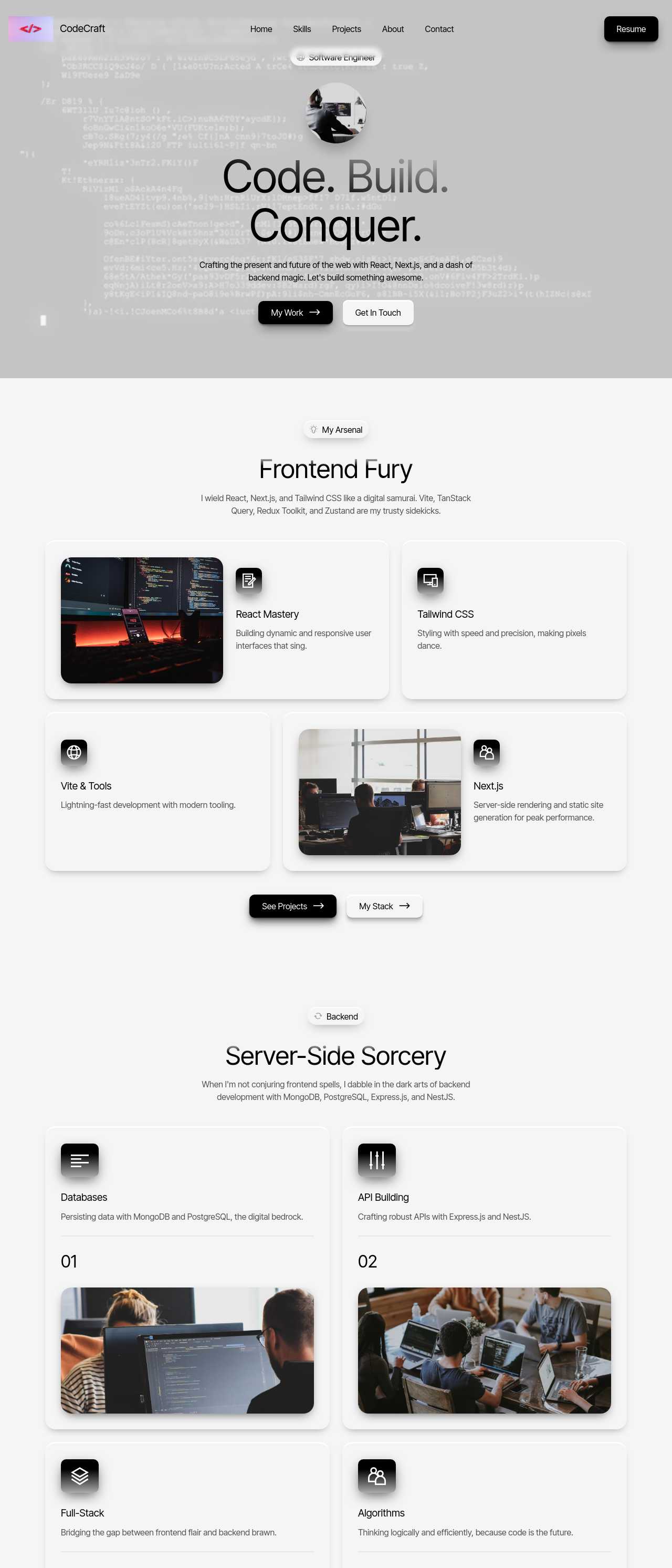
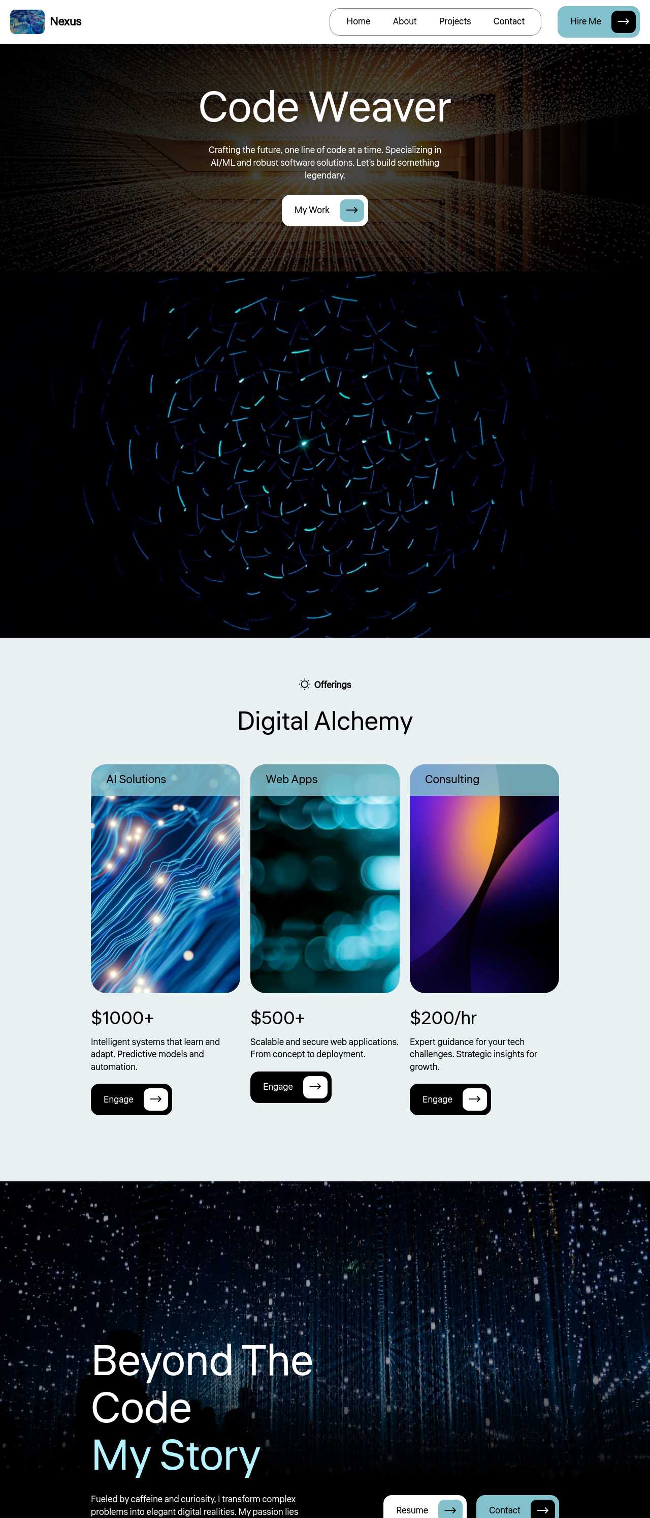
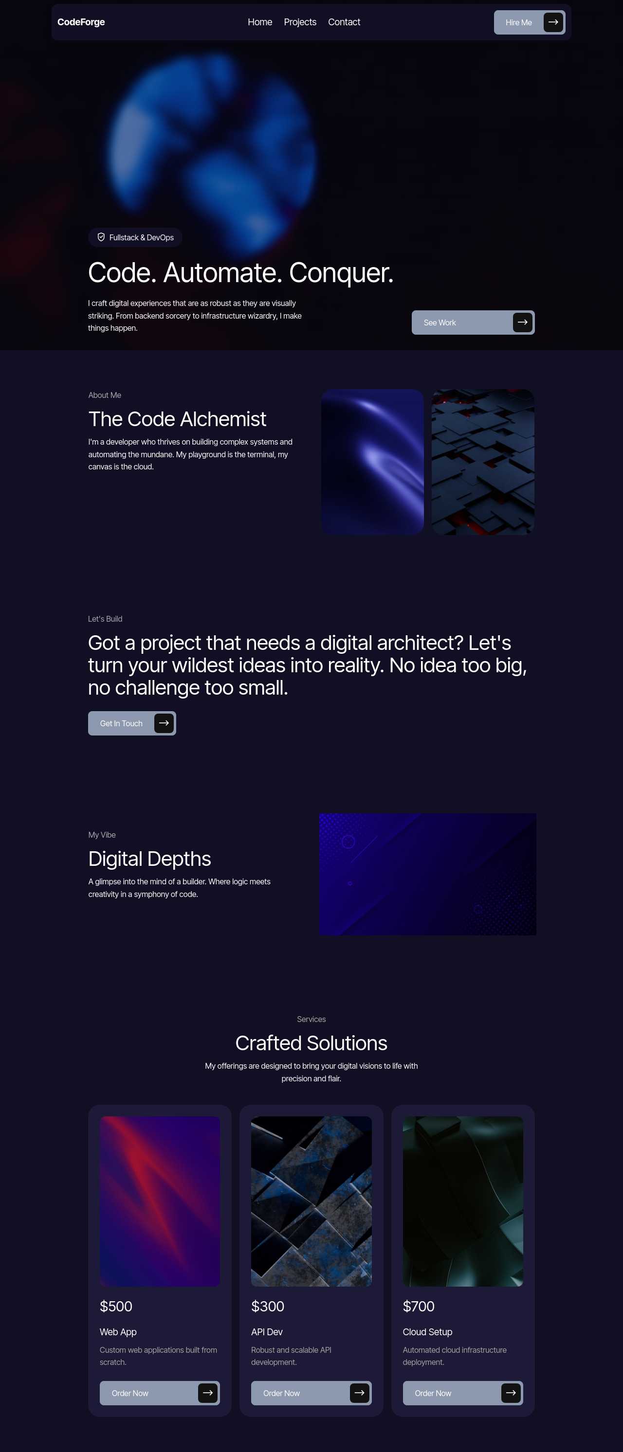
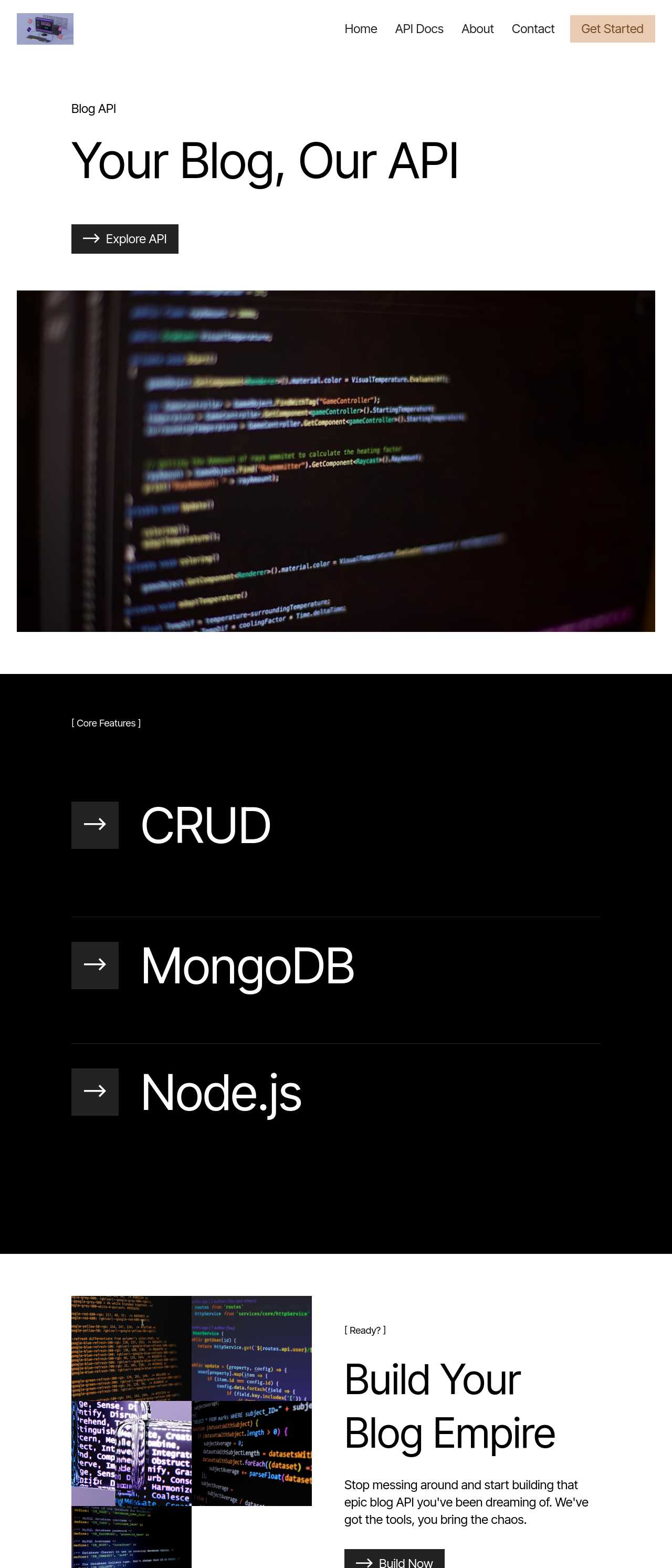
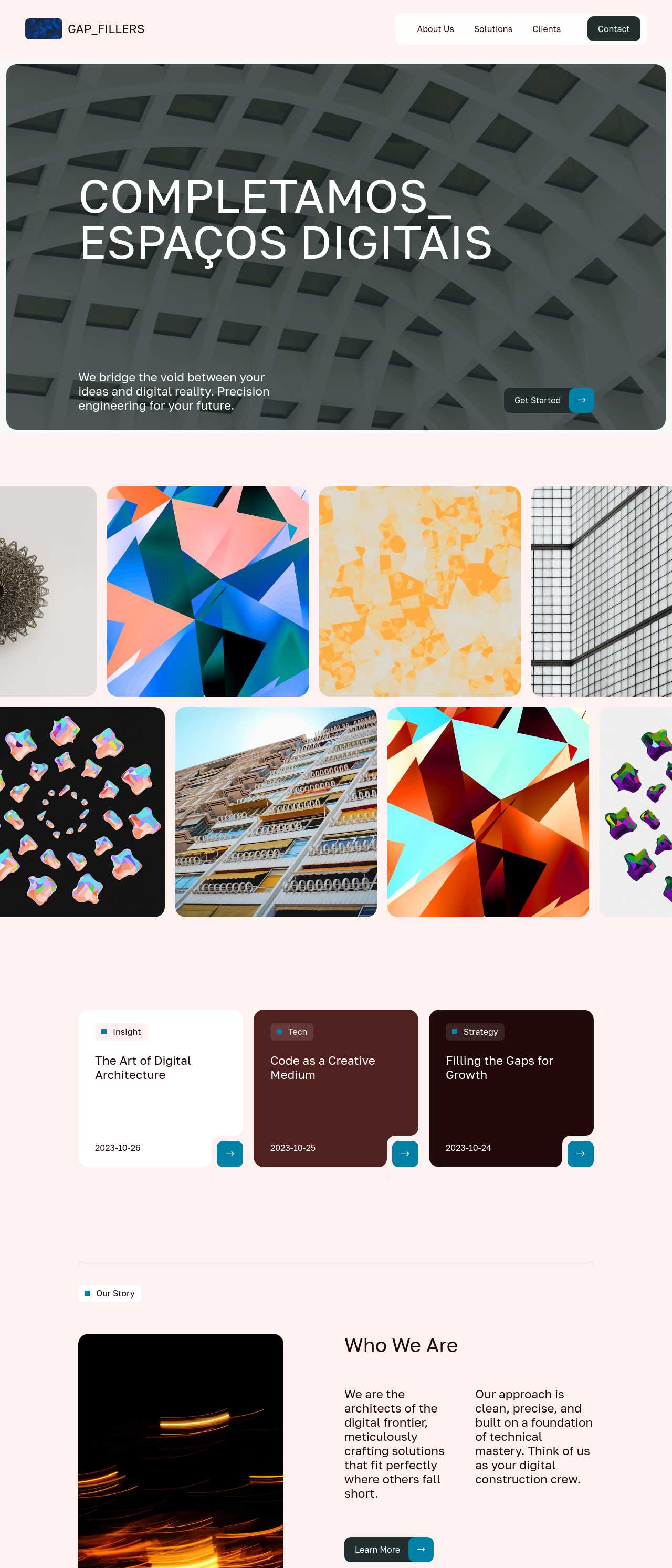
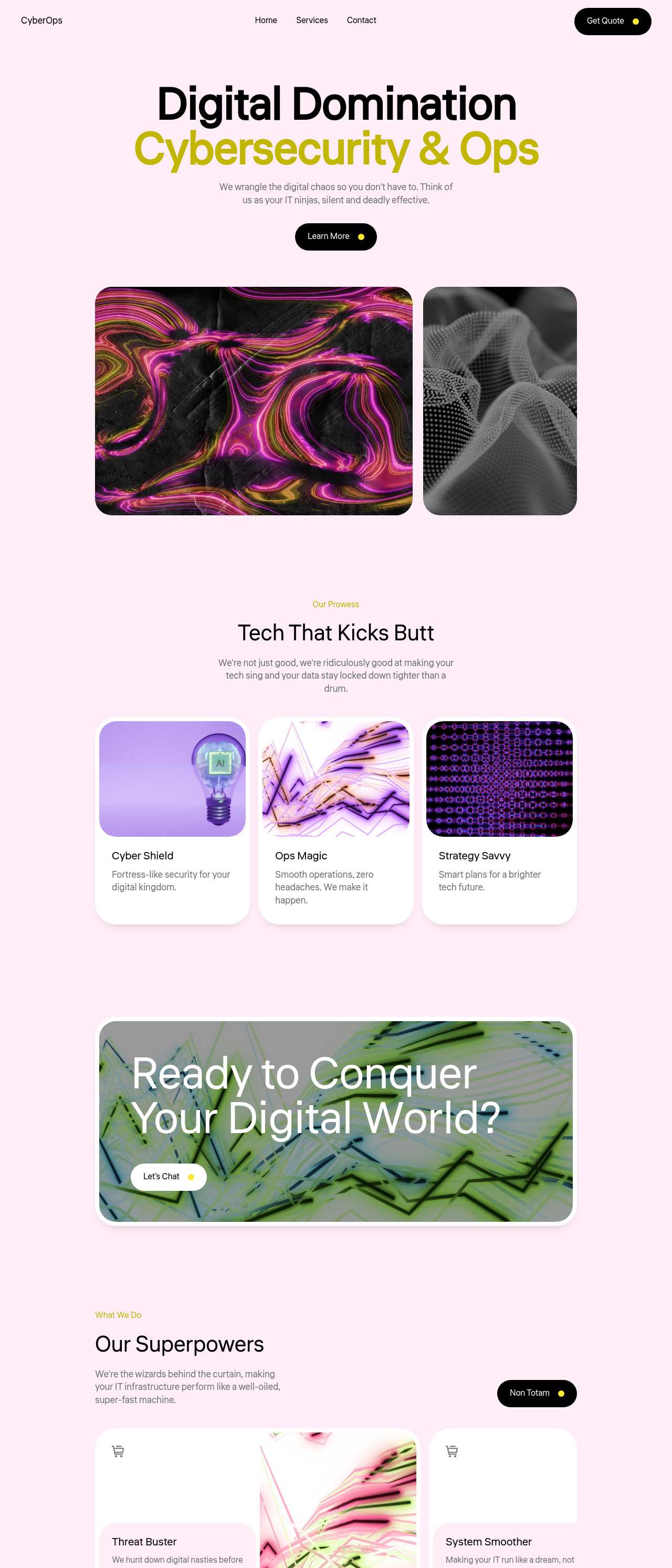
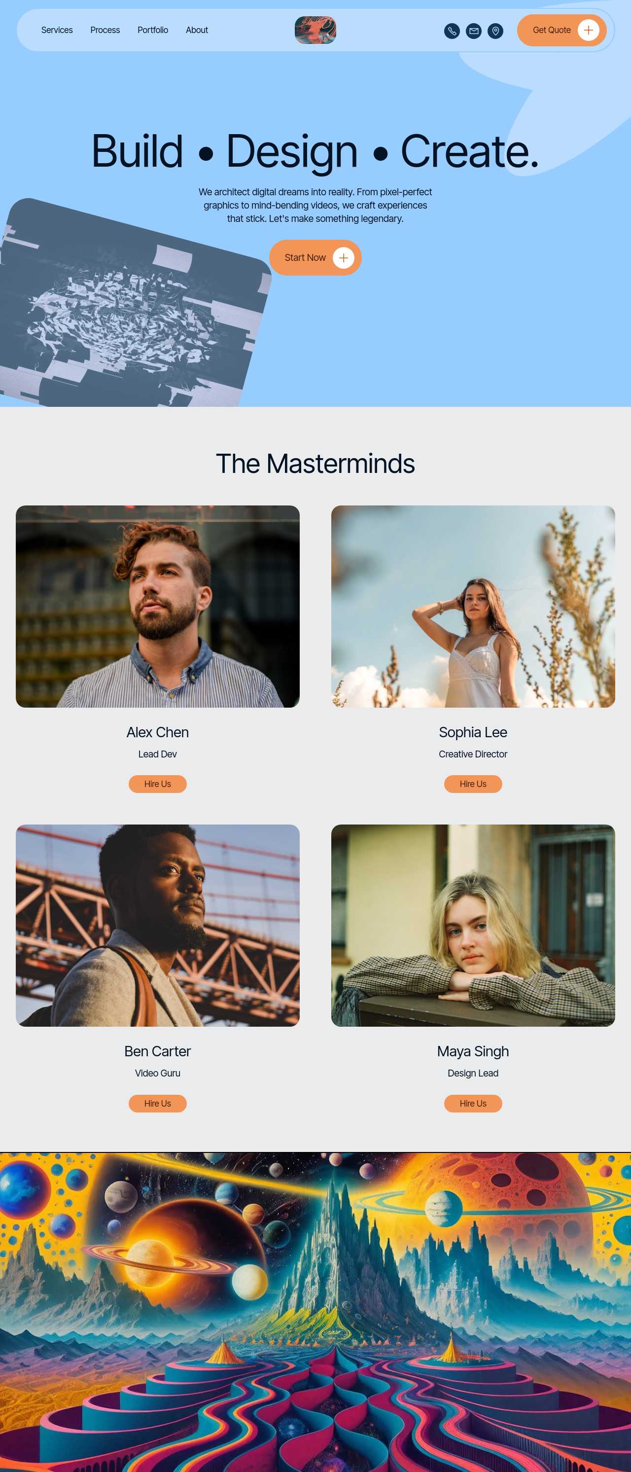
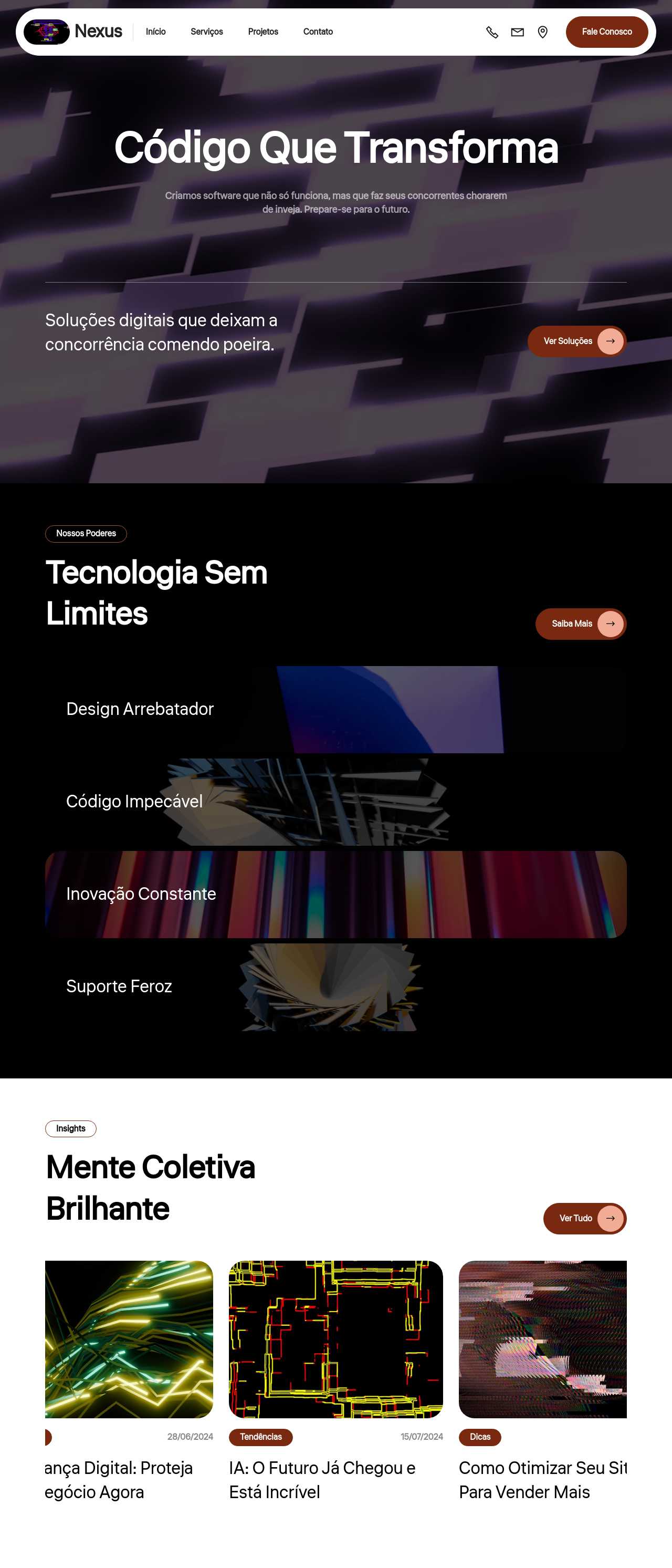
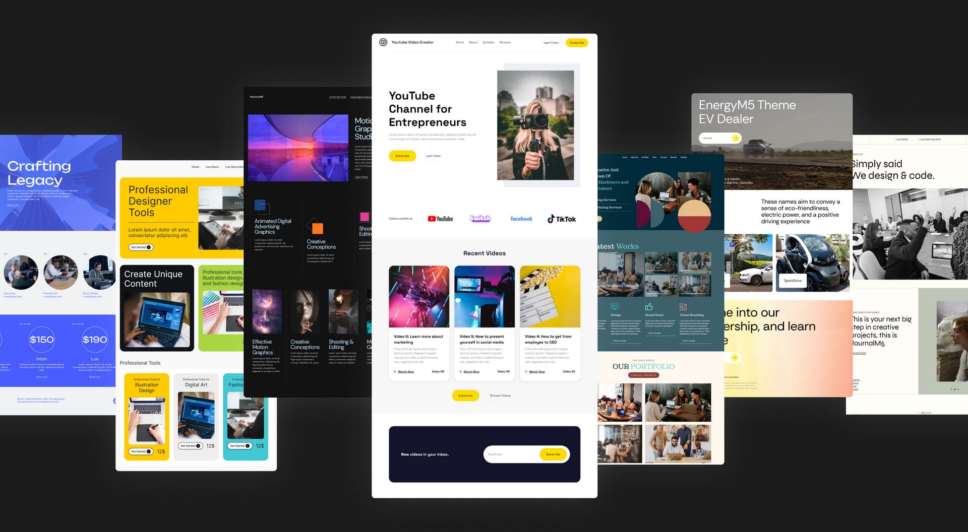
Live sites the community assembled from generated blocks — the kinds of components developers reuse across projects. Click any card to open the real site.
These composite scenarios reflect the most common ways developers and designers use the generator for individual UI blocks — treat them as starting blueprints, not customer testimonials:
For current independent feedback on the platform, check Trustpilot, Capterra, and G2 — and sort by date: recent reviews of the AI builder matter more than the historical average.
| Builder | AI features | Code export | Free plan |
|---|---|---|---|
| Mobirise AI | Text- and image-to-site, 4 variations, chat editing | Full HTML/CSS/JS | Yes — 3 sites |
| 8B AI Builder | AI content and layout generation | Limited | Yes |
| Wix AI | ADI, content suggestions | No | Yes (with ads) |
| GoDaddy | Quick AI setup | No | Trial |
| Squarespace AI | AI for copy and visuals | No | Trial |
| WordPress + plugins | Depends on plugins | Yes (self-hosted) | Core is free |