The Deeper Look - Mobirise Website Designing Software Review
Note: It's part 2 of Mobirise Web Design Software review
‹‹ Read the Prev Part 1 or Read the Next Part 3 ››
What I love most about Mobirise Native Theme blocks is they shine not with quantity but with quality and dependability and at the same time they are some kind of Swiss Army Knives – a single block can be adjusted to multiple appearance and tasks. With just a simple snippet pasted in the Custom CSS section of the Code Editor of the new Mobirise 3 theme can be achieved so much. And all of this is done without losing the Block Properties panel and the visual editing interface of the Builder.
In this part we’ll explore in detail some of the great Mobirise Website Software 3 newly introduced blocks and try to find cool and most importantly easy ways to expand their capabilities to the limit.
The Navbar
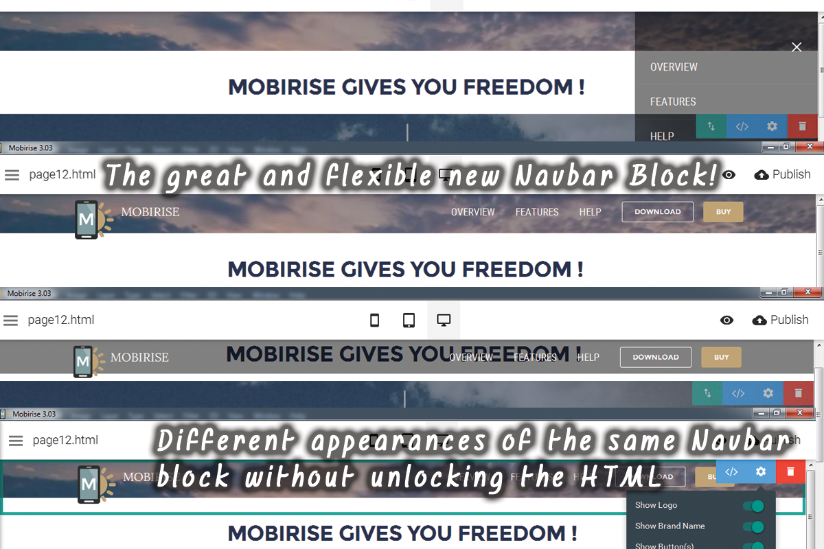
With the new theme comes an entirely new navbar extension. The old ones still are supported (and thank you guys for that!) for in order what’s been done so far on the older versions to maintain its functionality – you most certainly wouldn’t want to recreate a 30 page website navbar once again, would you?
The new menu has all the functionality required for such kind of element – it supports multiple levels of navigation links, scales well on different screen sizes and has both solid fill and outline buttons built in which is very cool.
A most pleasant improvement to be noticed is the way the options panel of the Navbar and the elements around it visualize in the Builder’s interface not overlapping with each other. As the Navbar controls show up exactly as supposed to, the controls of the block underneath it (the first content block) appear with significant offset down. It’s kind of confusing the first few times, but the relief you don’t have to play cat and mouse with those controls anymore is priceless! A very good solution to generally small but quite annoying issue which now is in the past.
There is a cool and fresh approach in web design – clearing entirely the navbar from all the navigation links and placing them in a convenient fly out panel always ready when you need them. This way the entire appearance gets much more simple and clear without any loss of functionality – on the opposite – navigating is eased by the much bigger place allocated to the fly out panel. This the web site also looks much more consistent since the navigation works the same way on all screens – it’s actually inspired by mobile browsing I think.
This behavior is achievable in Mobirise Website Designing Software with just a single click – all you need is just to turn the Collapsed option through the Navbar Properties panel – instantly you menu disappears leaving only the triggering button beside. In order to access and edit the menu you just need to click on the toggling button to call out the menu sidebar. A word of caution – if you happen to already have styled your Navbar to be shorter than its initial height you might encounter difficulties clicking on the toggle button if it gets overlapped by the block properties buttons. Not to worry though – the toggle clickable area is wider than the three horizontal bars symbols itself – just move your pointer a bit to the left until the block properties buttons fade out and click – voila! – you’ve uncovered the menu sidebar – now go and make the changes you need.
Unleash the power keeping your options
The new navigation module is no doubt great and the Properties panel – full of cool and useful options but taking in consideration the variety of personal preferences, designer visions and client requirements it’s obvious at one point you might experience some difficulties styling this block EXACTLY as you or your client envision It using just the block Properties panel. I think this is understandable and quite in order. In order to achieve such tasks we have the powerful Code Editor Extension. Actually this is one of the first things I do starting a new project – after the overall structure and appearance are more or less clear and I already have thrown in some content I take my time end style the navbar with few simple CSS lines in the Custom CSS Code field of the Code Editor. So I decided to create some kind of “Control Panel” snippet giving the user the control to change almost every Navbar feature you could think of – all you need is to paste the CSS snippet, change the parts you need and comment or delete the ones you don’t. I meant it to be usable by any user, especially by those lacking any skills in CSS – all the features are well commented, so all you need is to change the values up to your taste. I think this also is a best way a person who has never crossed paths with code before to see there is nothing to be afraid of – it’s actually fun, and wit Code Editor’s Preview Mode you can be calm you don’t have to remember the exact changes you’ve done to reverse tem – you just hit Ctrl + Z and everything goes back the way it was.
So here is the snippet itself – a Just Add Water pill to help you style almost everything about the navbar with the help of the Custom Code Editor.
/* *** Navbar *** */

/*next two selectors override the Color from the Preferences */
    /*Initial color and height - Transparent Option should be on from Preferences */
.navbar-dropdown.bg-color.transparent
    background:rgba(0, 0, 0, 0.3) none repeat scroll 0 0 !important;
    /*set the color and transparency for the initial position */
    height:4em; /*set the appropriate INITIAL height here */

.navbar-dropdown .navbar-logo img
    height:4rem; /* logo image initial height */

    /* Uniform Navbar Appearance */
.navbar, .nav-dropdown-sm, .nav-dropdown-sm .link[aria-expanded="true"], .nav-dropdown-sm .dropdown-menu
    background:rgba(0, 0, 0, 0.5) none repeat scroll 0 0 !important;
    /*set the color and transparency when scrolled down */

.navbar-dropdown.navbar-fixed-top
    height:3.5em; /*set the appropriate SCROLL DOWN height here */


.mbr-table-cell
    vertical-align:top;

/* set the toggle button vertical alignment*/
.navbar-toggler
    margin-top:1.3em;

.nav-dropdown .link
    margin:1em; /*postion the links accordingly */
    font-weight:400; /* set width of menu links - see Google Fonts for available values */

.navbar-dropdown .navbar-brand
    padding:10px; /* align the logo image */


.navbar-dropdown.navbar-short .navbar-logo img
    height: 3.3rem; /* logo image scrolled down height */


.navbar-dropdown .navbar-logo img:hover
     /*set the appropriate behavior of logo on hover */
    /* useful online effects generator can be found at http://css3gen.com/ */
    -moz-transform: translate(0px, -8px);
    -webkit-transform: translate(0px, -8px);
    -o-transform: translate(0px, -8px);
    -ms-transform: translate(0px, -8px);
    transform: translate(0px, -8px);

.navbar-dropdown .navbar-caption
    vertical-align:top;
    padding-top:2px; /*fine tune brand name position */
    font-weight:400; /* set weigh of menu links - see Google Fonts for available values */

/* ** Collapsing side menu - right aligned ** */
/* with Collapsed option turned ON these lines align the fly out menu to the right side of the screen - if you prefer the default alignment - just leave them commented */
/*.nav-dropdown.navbar-toggleable-xl
    left: initial;
    right: 0;
    transform: translateX(100%);

.nav-dropdown-sm.collapsing, .nav-dropdown-sm.collapse.in
    transform: translateX(0px);
    transition: all 0.25s ease-out 0s;
    visibility:visible!important;

.nav-dropdown-sm.collapsing[aria-expanded="false"]
    display:hidden!important;
    transform: translateX(100%);
    -ms-transform: translateX(100%);
    -webkit-transform: translateX(100%);

.navbar-dropdown .navbar-close
    left:initial;
    right: 0.6875rem;
    position: fixed;
    top: 0.75rem;
    z-index: 1000;

.collapse
    visibility:hidden!important;
*/
/* end of collapsing side menu - right */
And the best part is unlike unlocking the block HTML with this approach you don’t lose the Block Properties panel – this is the beauty of the Code Editor’s Custom CSS Panel
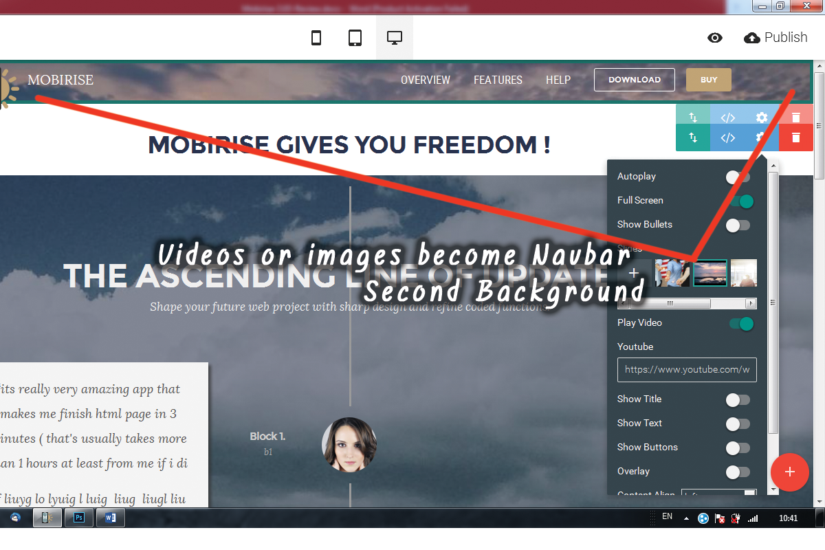
Sliding images or even a video as a second navbar background – some cool stuff you can do with the slideshow block
Since we’re talking about expanding capabilities further let’s talk wouldn’t it be nice if we could have also an image for background of our Navbar, or even more – a slideshow of different image backgrounds or maybe even a movie.
Achieving this in Mobirise Website Designing Software 3.0 is actually much easier and faster than you probably think. We’ve already got a block with such functionality – we just need to style it a bit in order to fulfill the task we need. And the best part is again we’ll use only a quick CSS snippet and end up with a block with entirely untouched Properties Panel for easy and fast adjustments later on in the process – as easy as that. All you need is pasting the fallowing “Just add water” snippet in your Image Slider Block Custom CSS area, set up the parameters and enjoy the results
/* *** Set Carousel as navbar background */
.carousel-inner
    height:10em; /* set element height - adjust it to match initial navbar height if you need it as navbar background and comment the fallowing two lines*/
/* Set the Carousel as a distinct element or an extension of the navbar background */
    margin-top:4em; /* set the free space around element or comment these lines to position exactly behind navbar*/
    margin-bottom:4em;


.mbr-section
    background-position:50% 80%; /*play with background vertical position in order to achieve consistent appearance with the previous/next slider if any */

/* Styling the navigation buttons */
.carousel-control
    display:none; /*turn on/off buttons */
    /*set the button parameters */
    background: rgba(20,20,20,0.5) none repeat scroll 0 0;
    border: 0 none;
    border-radius: 50%; /*round-square button*/
    height: 70px; /* button dimensions */
    width: 70px;
    /* set the arrow parameters */
    line-height: 70px;
    color: #fff;

.carousel-control:hover
    /*set the button parameters */
    background: rgba(120,0,0,0.5) none repeat scroll 0 0;
    border: 0 none;
    border-radius: 50%; /*round-square button*/
    height: 70px; /* button dimensions */
    width: 70px;
    /* set the arrow parameters */
    line-height: 70px;
    color: #fff;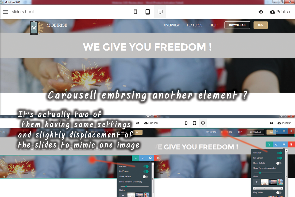
Some other uses of the Carousel styling CSS script
You probably have noticed that just a part of the above snippet concerns styling the element as a Navbar background. Using it you can also easily achieve some other cool appearances – you can make the slideshow as tall as you find it suitable to be, offset it from the surrounding elements, giving it some space to breathe or even mimic a slideshow split by other elements – just place two or more carousel blocks with identical settings and displace the contained images to make them look as one. The last part requires some trial and error but it’s kind of fun.
You can also style the appearance of the navigation buttons if you decide to have ones in your slideshow or hide them if you don’t need them.
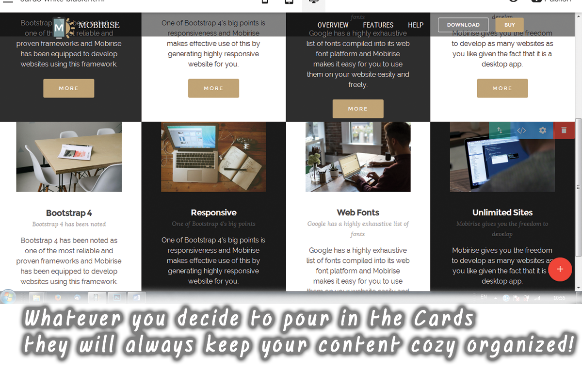
Let’s play with the cards
The cards are new elements introduced by the Bootstrap 4 framework. Browsing around you’ve probably noticed the common trend putting similar groups of content in equally sized rectangular areas in a website. This way the information presented gets cozy and legible organized in light and easy and digestible way. Well – that’s what cards are for. This element is actually so flexible, it can be used for practically everything – from setting up your online sore to pointing out your main ideas or showcasing your portfolio – all you need is well organized content and Mobirise Website Designing Software.
Unlike the old Mobirise native theme here you don’t get to choose how many cards to display in a row, but frankly I don’t think this is actually necessary – three are too few – the content gets too large and distort the eye and on the opposite – if you try placing 6 cards in a row the content gets so small it’s hard to read again. So four cards in a row is just the perfect and balanced solution.
The default cards block comes with multiple styling capabilities – you can freely turn on and off captions, replace the images with some of the best web icons we talked about earlier and even have an image as a background for the half of the cards in the block and select a cool corresponding color for the others. The block is so well thought and flexible, it’s much probable you will be able to achieve almost anything utilizing just the Properties Panel. But still I’ve prepared two small snippets for you – just in case you happen to need them.
Check – mate
A cool way to showcase your content might be styling the cards in adjacent blocks with check-mate contrasting colors in order to get viewer’s attention and achieve stylish appearance. It’s quite in order to guess you would need to do so with the text content too in order to obtain best legibility. But as you probably know the texts having similar function in a block style uniformly – so it’s either black or white everywhere. Here a small CSS code comes in aid – just paste it in the Custom CSS field of the block you need adjusted and select the color you think matches best for the odd cards – the color of the even ones – just select it from the graphic interface of the builder:
/*set different font colors for the odd cards in block*/
.striped .mbr-cards-col:nth-child(2n+1) h4
    color:#444;

.striped .mbr-cards-col:nth-child(2n+1) p
    color:#444;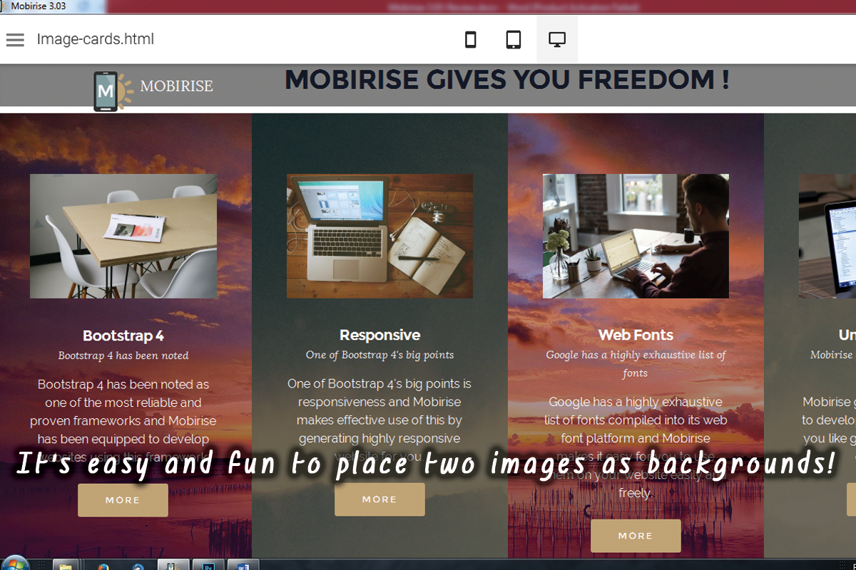
Images all around
As I already said the Cards Block is great – you can achieve multiple brilliant appearances but still – let’s dream big! The first thing I thought about when I saw the even cards in the block can have an image as a background was – Great! Let’s put another one as a background for the odd ones! But how? Easy – you just need a simple CSS snippet and an appropriate images to fortify your content. Let’s take a look at the snippet and I’ll share with you some simple things to have in mind while using it:
/* to keep the things as simple as possible we'll use an online tool to fade the image. A good one is www.tuxpi.com */
/* if you want same pattern on both elements replace the numbers with 2n+1 */
.striped .mbr-cards-col:nth-child(1)
    background-image:url('file:///D:/Mobirise-Website-Designing-Software/3-03-Review/img/sunset-faded.jpg'); /* replace with the path to your file - the easiest way is to just copy/paste the path and replace the slashes */
    background-position:0% 50%; /* set the appropriate position to make both images blend in as one */

.striped .mbr-cards-col:nth-child(3)
    background-image:url('file:///D:/Mobirise-Website-Designing-Software/3-03-Review/img/sunset-faded.jpg');
    background-position:50% 50%; /* set the appropriate position to make both images blend in as one */
First of all for convenience and faster edit ability it’s essential to leave the custom HTML of the block locked and benefit the Properties Panel. But it’s also a good thing to have some kind of color overlaying the image which is usually done by adding an extra HTML element over the one containing the image as background. As always – a give and take game. So what we’ll do is to use a simple online tool to apply the overlay directly to the image we want as a background of the odd cards and then just insert it in our Mobirise Website. It might require a few trials to get the perfect amount of overlay but the result is worth the efforts – you are going to keep the Preferences panel and all the benefits coming out of this. So just go to your favorite image editing tool, or in case you don’t have one yet – for example to http://www.tuxpi.com apply the overlay you think will work best and save the image by a different name (you might need the original later – for further play with the overlay color in a few days for example). It’s a good idea to give a short and meaningful name – you are going to type it in a minute. Now comes just a bit tricky part – pointing the Mobirise Web Design Software the correct path to draw the image from. To do it right, remove everything between the three slashes and the closing quote – should look something like this:
background-image:url('file:/// ');Now copy/paste the path to the image you need and replace the \ slashes with / (like the ones already there) – almost done. Last step – add an extra slash and type your image name INCLUDING the file extension. Something like
background-image:url('file:///D:/MyWebsite/img/CardsBack.jpg ');Great! Next just replace the path in the next line where it appears. Now if you think it’s necessary you could play a bit with both background images position or leave as is if you like the results. You’re done!
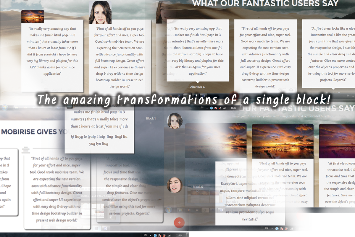
Never judge for the name! Uncovering the testimonials block hidden potential
Deep down in the Blocks Panel lie some hidden treasures masked by the name of Testimonials Blocks. These newly introduced in Mobirise 3 blocks are actually a great example for the flexibility of the Mobirise Website Designing Software and I’ll tell you why.
The Testimonials Blocks are powered by the same Bootstrap 4 element as the previous Block type we discussed – they are actually cards styled differently. And as long as they serve great the purpose they are announced with – you can create amazing section about your clients feedback with them – at the same with just a CSS styling snippet from these very same elements in this very same block can be implemented ENTIRELY different view - both in appearance and functionality. And of course the best part – without harming the Visual Interface editing capabilities and Properties panel not just a bit – the block just contains everything needed for this. The appearance of this Mobirise Elements could be altered so further that looking at the results it gets hard to believe they all originate from the same predefined block – only with CSS.
Here I’m going to share with you the snippets for this transformations. All you’ll need is to paste them in your Custom CSS section and of course change a value or two in order for them to best blend in your overall web site appearance.
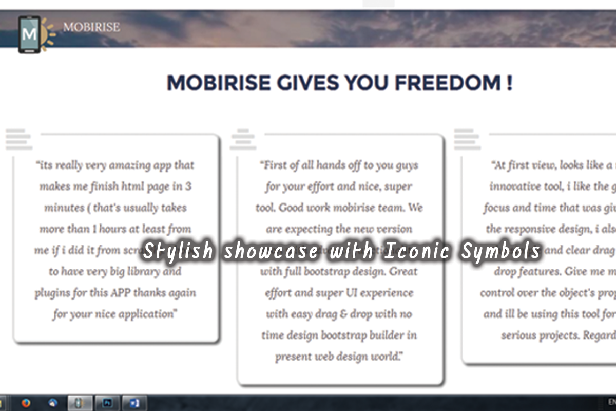
Features showcase with a symbol
Here we’re going to convert the testimonials block into a features showcase with a cool Font Awesome icon in the corner to fortify the impression. Just follow the instructions from the comments to select the most appropriate icons for your content. If you find the conversion difficult – we have an article where the process is widely explained – make sure you check it out first. And don’t worry – it only looks a bit complicated at first – converting icon codes for CSS is easy and fun!
/* *** Content block transformation *** */
/*uncomment to set the distance from the caption if it's ON
.mbr-section__container--middle
    margin-bottom:10%!important;
*/
/*disable the little square at the bottom*/
.mbr-testimonial .card-block::after
    display:none;

/*style the icon of every odd element */
.col-xs-12:nth-child(2n+1) .mbr-testimonial .card-block:before
    background-color: #fff; /*set a color blending with the background */
    font-family:FontAwesome;
    content: "\F036"; /* converted value from the Font Awesome Cheat sheet - use https://r12a.github.io/apps/conversion/ to convert it */
    font-style:normal;
    font-size: 2.5em; /* set icon size and color */
    color:#ddd;
    display: block;

    left: -0.6em; /* set icon position and background */
    top:-0.8em;
    position: absolute;

    height: 1.6em;
    width: 1.6em;

/*style the icon of every even element */
.col-xs-12:nth-child(2n) .mbr-testimonial .card-block:before
    background-color: #fff; /*set a color blending with the background */
    font-family:FontAwesome;
    content: "\F037"; /* converted value from the Font Awesome Cheat sheet - use https://r12a.github.io/apps/conversion/ to convert it */
    font-style:normal;
    font-size: 2.5em; /* set icon size and color */
    color:#ddd;
    display: block;

    left: -0.6em; /* set icon position and background */
    top:-0.8em;
    position: absolute;

    height: 1.6em;
    width: 1.6em;

/*copy/paste the icon styling snippet or/and play around with the n formula to get the desired appearance */

 .mbr-testimonial .card-block
    border:0.2em solid #ddd; /* set content area border color and radius */
    border-radius:3%;
    background-color:#fff;
/*optional - set some shadow effects - get the code from http://css3gen.com/box-shadow/ or leave as is*/
    -webkit-box-shadow: 4px 4px 5px 0px rgba(50, 50, 50, 0.75);
    -moz-box-shadow:    4px 4px 5px 0px rgba(50, 50, 50, 0.75);
    box-shadow:         4px 4px 5px 0px rgba(50, 50, 50, 0.75);
This and all the Testimonial snippets successfully work on both types of blocks – with a single and with multiple elements in a row.
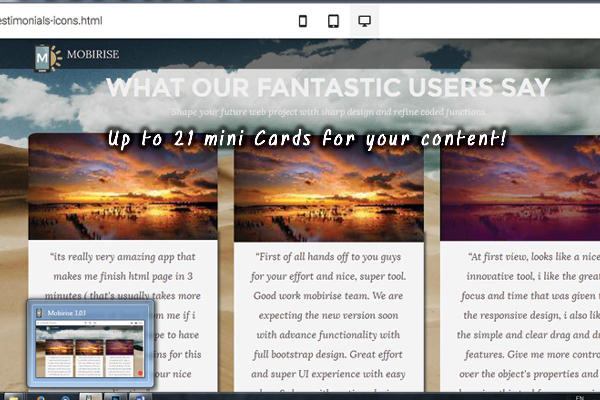
Let’s make some Mini Cards!
With a similar snippet you can transform the Testimonials block into a set of three or a single card in a row. A word of warning – please have in mind the overall appearance and the legibility of site – choose your layout, content and especially the inserted images proportions in a way maintaining a clear and balanced view. When you replace the sample images you should know the new ones will scale to fit the width of the placeholders.
And here is the snippet:
/* *** Cards transformation *** */
/*set the distance from the caption if any */
.mbr-section__container--middle
    margin-bottom:10%!important;

/*disable the little square at the bottom*/
.mbr-testimonial .card-block::after
    display:none;

/* position the image - negatives are allowed */
.mbr-testimonial .card-footer
    width:100%;
    position:absolute;
    bottom:95%;
    left:0%;

/* adjust image width and border radiuses */
.mbr-author-img
    height: auto;
    width: 100%;


/* uncomment and adjust image width for different size than element width
.mbr-author-img img
    height: auto;
    width: 80%;
 */

.img-circle
    border-radius: 5% 5% 0% 0%;
    width:100%; /* comment Me for image size different from element width */


.mbr-author-img img
    height:auto;

.mbr-testimonial .card-block
/* optional -  uncomment to set content area border color and radius */
 /*   border:0.2em solid #ddd;
    border-radius:3%;
    background-color:#fff;*/
/* set some shadow effects - get the code from http://css3gen.com/box-shadow/ or leave as is*/
    -webkit-box-shadow: 4px 4px 5px 0px rgba(50, 50, 50, 0.75);
    -moz-box-shadow:    4px 4px 5px 0px rgba(50, 50, 50, 0.75);
    box-shadow:         4px 4px 5px 0px rgba(50, 50, 50, 0.75);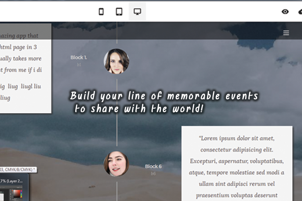
Let’s make a Timeline!
This one is a tricky one, but I truly love it. Combined with the new uniform website animation functionality the Testimonials block is capable of aiding you creating beautiful timelines which elements gracefully emerge one by one as the user scrolls the site down.
Here is the snippet – just pour it into your Testimonials Custom CSS section and enjoy!
/* *** Testimonials to Timeline transformation *** */
/* captions go over the timeline */
.mbr-section__container--middle
    z-index:10!important;

.card-block
    padding:1em;

.mbr-author-img
    margin-top:0;

/*  *** Timeline Middle Line *** */
.col-xs-12:nth-child(3n+2) .mbr-testimonial .card-block
   display:none!important

/* the line displays only on large screens and up */
@media (min-width: 62em)
/* set the timeline image vertical position */
    .col-xs-12:nth-child(3n+2) .mbr-testimonial .card-footer
    top:5em;


    .col-xs-12:nth-child(3n+2) .mbr-testimonial .card-footer .mbr-author-name, .col-xs-12:nth-child(3n+2) .mbr-testimonial .card-footer .mbr-author-desc,
    display:none;

/* set the first line length to match the exact block height */
.col-xs-12:nth-child(2) .mbr-testimonial .card-footer:before
    height:400%!important;


/*style the timeline appearance*/
    /*upper segments */
.col-xs-12:nth-child(3n+2) .mbr-testimonial .card-footer:before
    display:block;
    background-color:#9a9a9a;
    height:160%;
    width:3px;
    content:"";
    position:absolute;
    left:50%;
    bottom:120%;

    /*lower segments */
.col-xs-12:nth-child(3n+2) .mbr-testimonial .card-footer:after
    display:block;
    background-color:#9a9a9a;
    height:160%;
    width:3px;
    content:"";
    position:absolute;
    left:50%;
    top:120%

/* set the last line segment length to match the block height */
.col-xs-12:nth-last-child(2) .mbr-testimonial .card-footer:after
    height:300%;


@media (max-width: 62em)
/* set the timeline image vertical position */
    .col-xs-12:nth-child(3n+2) .mbr-testimonial .card-footer
    display:none;


/* *** Timeline Events *** */
/* zig-sag hide panels to get the timeline events with the rest */
/* for reverse arrangement replace (6n+3) with (6n) and (6n+4) with (6n+1) */
.col-xs-12:nth-child(6n+3) .mbr-testimonial,
   display:none!important

.col-xs-12:nth-child(6n+4) .mbr-testimonial
   display:none!important

/* styling the timeline cards for reverse alignment replace (6n) with (6n+3) and (6n+1) with (6n+4)  */
.col-xs-12:nth-child(6n) .mbr-testimonial .card-block:after, .col-xs-12:nth-child(6n+1) .mbr-testimonial .card-block:after
   display:none;

.col-xs-12:nth-child(6n) .mbr-testimonial .card-footer .mbr-author-img, .col-xs-12:nth-child(6n+1) .mbr-testimonial .card-footer .mbr-author-img
   display:none;

@media (min-width: 62em)
.col-xs-12:nth-child(6n+1) .mbr-testimonial .card-footer
    width:50%;
    position:absolute;
    bottom:50%;
    right:-50%;
    z-index:1000!important;

.col-xs-12:nth-child(6n) .mbr-testimonial .card-footer
    width:50%;
    position:absolute;
    bottom:50%;
    left:-50%;
    z-index:1000!important;


.card-block
    -webkit-box-shadow: 4px 4px 5px 0px rgba(50, 50, 50, 0.75);
    -moz-box-shadow:    4px 4px 5px 0px rgba(50, 50, 50, 0.75);
    box-shadow:         4px 4px 5px 0px rgba(50, 50, 50, 0.75);
And of course don’t be afraid to play around with the values to style the block as closer to the Sweet line as possible. Remember – it’s all entirely reversible if you use the preview button in the Custom Code Editor.
The power of CSS
As you just saw there is much to be done with the native Mobirise Website Designing Software blocks with just relatively simple CSS transformations. I actually think this is the best balanced way to both achieve the desired appearance and maintaining all the benefits of the great Mobirise Graphical Editing Interface.
But since as all best projects Mobirise is a work in process – always improving trying to stand on the top of the wave there always will be some layouts or functionality to be required by the situation but missing at the time in the Predefined Blocks Panel and this is quite normal. This is when the most powerful and advanced feature of the Custom Code Editor comes in hand – the Custom HTML Section.