Meet BusinessM4 one page website templates - awesome theme for business aims! Part 2.
The service I'm talking about is not only convenient but also quite secure – for example when you enter your email for the very first time in a form's options panel, upon the very first time this form gets submitted you get to receive a confirmation email asking you to verify you actually own the email you have pointed out. This is one time only for the use of an email with forms in Mobirise Builder and when you do confirm your email you also get a username and password you can use to login in your account's dashboard where you can track all your submissions from one place and even export the information submitted.
Extra tip: If you happen to be making a website using this best HTML theme for a friend or a client – make sure you either have access to their email to verify it or just explain them through the procedure in advance in order to grant yourself flawless usage of all the forms you need with this email later on without taking any further actions. Personally, I make the first test submission in an early development stage, take care of the verification if needed and go on forgetting about it. Additionally – if you prefer handling submissions with your own mailing script – just fill in the path leading to on your server instead of email in the very same field.
So – if you need to attract some email subscribers at the beginning of your site – just drag/ drop the header with subscribe form, type in your email and enjoy!
And once the visitor has already been introduced to whatever the site is about, it's time for a bit further showcasing of all the
Great features of these one page website templates
You are providing. When it comes to this best HTML5 template is probably the best packed with cool and creative ways to do that amongst all its relatives in the M4 best HTML5 templates family. The block palette's Features section comes fully packed with pretty much any appearance you might ever think of and maybe – even a few you might find a pleasant surprise. Let's take a look at them starting with my personal favorites:
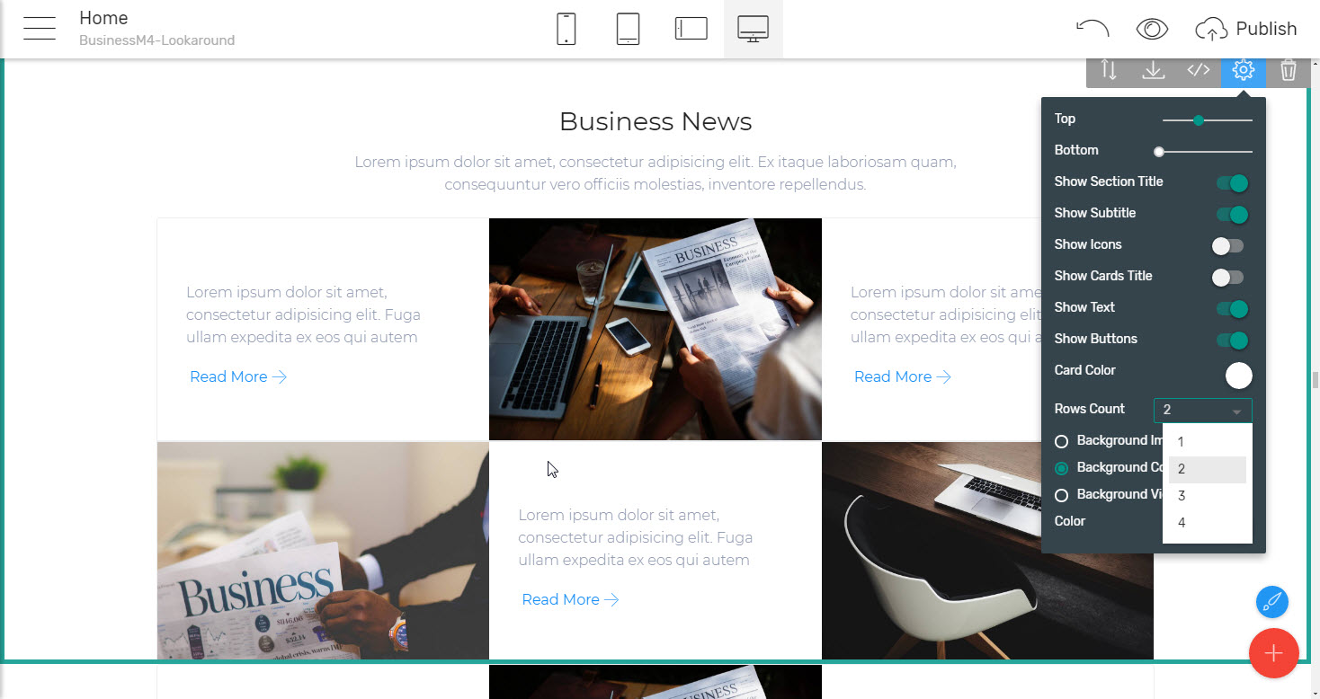
The tiled image and text feature block which makes it both interesting and easy for the viewer to get around with whatever you decided to showcase. These little square boxes give you the ability to actually get out of the box of image/ icon /text template and do something fresh and creative still having the text and the corresponding imagery close enough in order to work together nicely. Taking a closer look at the options available in the block's properties panel you might probably notice that the tile rows are limited to three in a single blocks but that's actually not an issue at all since by just inserting another block of the same kind below, hiding the heading and text and adjusting both block's padding sliders gives you consistent appearance of a fluent mosaic of as many tiled rows you need to. You can actually use this little trick to even reverse the sequence and have two text elements taking place over each other if needed.
Another cool thing I really enjoyed about the features showcase capabilities of the BusinessM4 best HTML5 template is the
Mixed layouts
combining elements of different kind sharing the same row. Here are some examples:
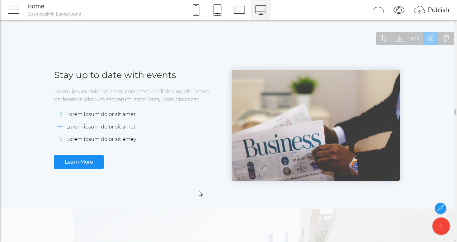
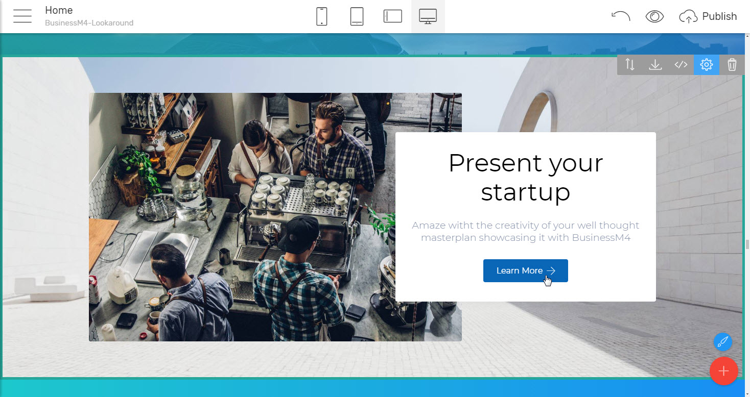
Image with a short description combined and a call to action button
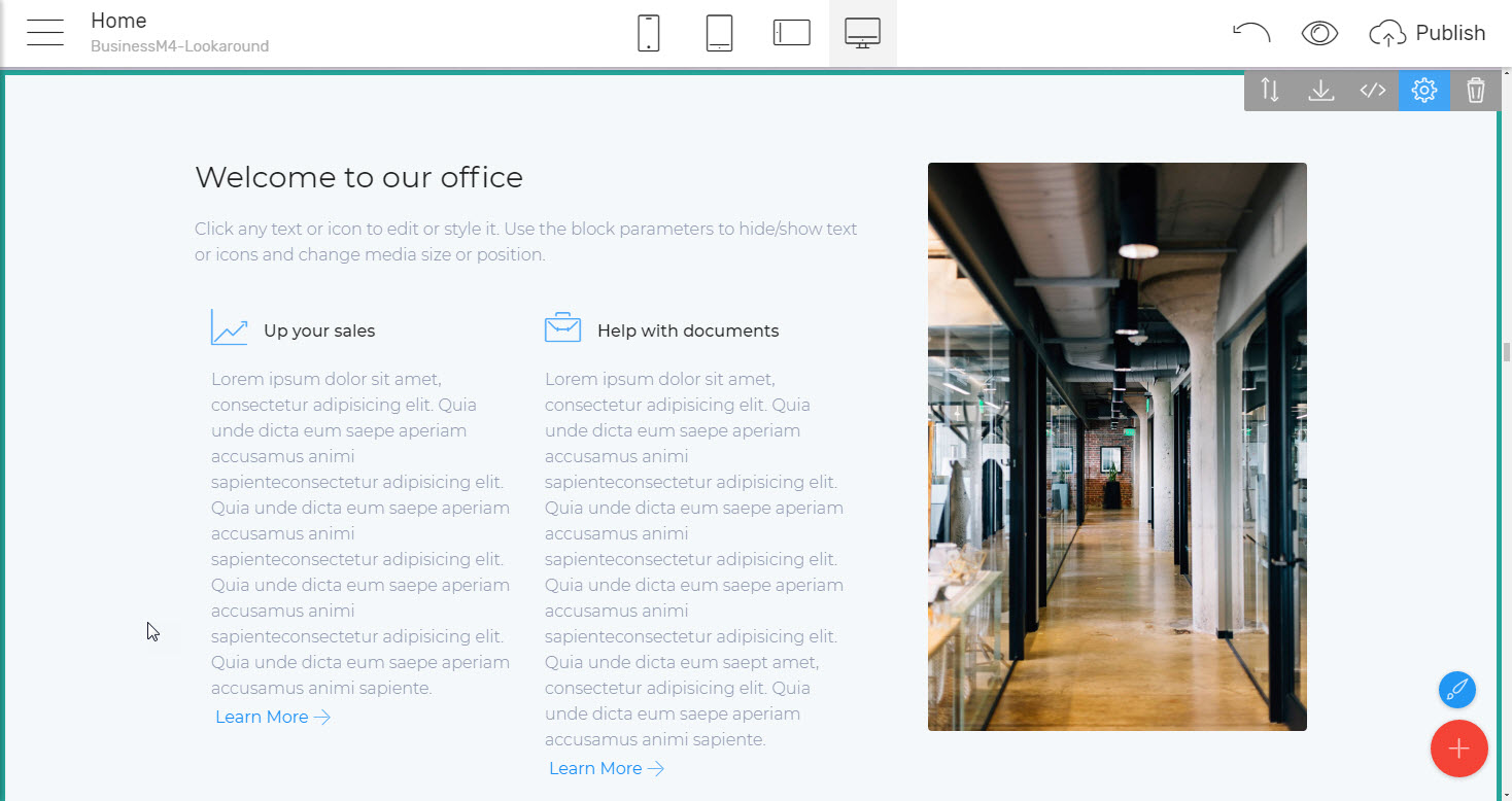
The same approach but reversed – a few cards- or list-like laid out features combined with an image. This very layout gets a few creative implements since regarding the way features are presented and the proportion of the image the overall impression drastically changes. Additionally – this is a cool way to handle a bit long description when needed making the image take some space similar in height to the text.
And to make the armory of blocks with this creative layout even richer there also is a block letting you put a short description under the image element as well.
Did you know you could use a features block as a
mid-site navigation
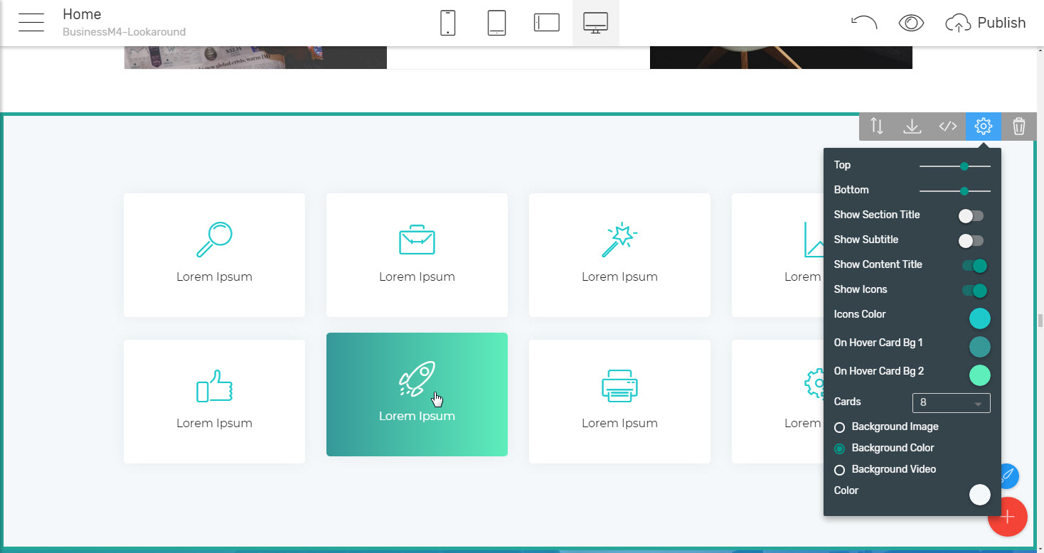
as well? No? Take a look at the cool block providing you crisp and large button-like cards with a caption and icon. To make the experience even richer each card animates and changes color to a beautiful gradient once it gets hovered, so it's not only a functional but also a quite interesting and pleasing the eye block as well.
The experienced Mobirise Builder user might initially think there is a little flow in the way the properties panel of this block has been composed – like there isn't any control for adjusting the card's background in its normal stage – when not being hovered. I think this is rather an intentional decision than a miss since yes, it would be easy to add an extra color picker in Properties but let's not forget we're aiming for clean and simple with this best HTML theme. We do have a flashy hiver background, so in order for it to really stand up and not appear as a bit too much the plain white background is needed to for the viewer to make the difference. I guess that's why the card's background has been left out of reach.
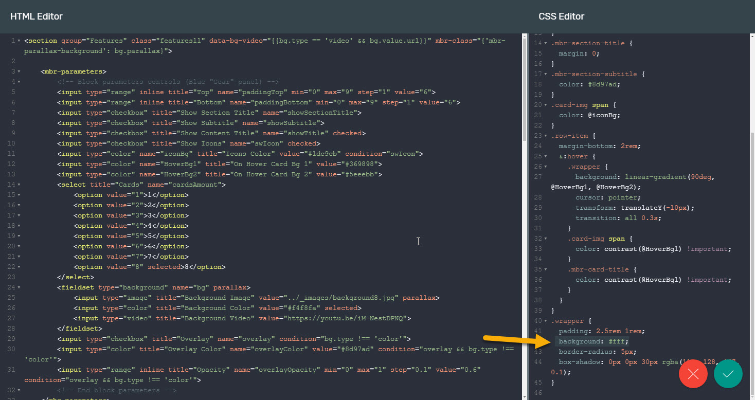
Mobirise Builder Pro Users Tip: The class handling the card's background color is called .wrapper and you can find it at the very bottom of the block's Custom CSS. The particular background declaration is located on the line 42
Another creative implement I really loved in this section of blocks is the
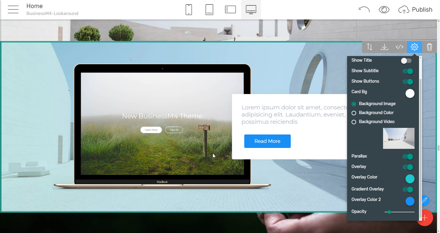
Card overlapping an image
The appearance which no matter the simplicity in implement I consider to be quite interesting and appealing. In my eyes, this light and simple effect create an organic bond between whatever has been said and the picture underneath. There was no the visitor might not figure out these two are going anyway else but together. As can be seen from the sample blocks this works as well with images fully filling their bonds as with images with the background cut out leaving only the product. The only thing to pay attention for in the second case is the actual placement of the product on a picture so this slight overlapping effect doesn't get missed.
And to make things even better with the next blocks you can even
Make the background work as main image for you.
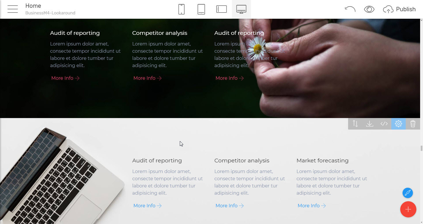
With the next clever implement. Just pick up a proper image with the needed item placed aside – either left or right and the background covering pretty much the rest of it and place it as a background image of the blocks with features especially pushed or pulled to the other side of the product and you'll get this subtle still useful appearance
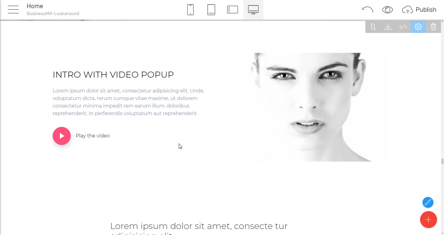
I think a bit special attention describing this best HTML theme should also be given to the block with a video pop-up also included in BusinessM4 best HTML theme for two reasons. One, the most obvious is of course as the name itself suggests – it comfortably holds a video within. A video which isn't taking any space on screen initially but with a single click expands to fill the entire screen and therefore be easily watched utilizing the full screen's capabilities. It's not only cool but extremely useful and I believe anyone struggled to tap a few times on the phone, losing the first 10- 15 second of content until the embedded video in a web page viewed from mobile gains at least decent appearance will agree with me this little piece of comfort – just tapping - and watching comes to be one of those tiny little things the big picture gets built of. And exactly the little things are the ones that matter. We often don’t seem to even notice them when there but once getting used to those – feel their absence drastically.
Especially on small screens where every pixel matters with this block the precious space is much better used – you can easily place some introducing words and/or an image to prepare the viewers for the clip letting them decide to either launch it or not.
The other thing the block with a video pop-up caught my attention with is was the brilliant example of one of the simples yet still golden effects in web design – obtaining the organic appearance of the image on the page making the inevitable rectangular background "disappear" leaving only the significant part of the image remaining.
This simple thing – matching the image's and block's background colors, especially combined with a proper picture selection is still capable of producing amazing results, as can be seen in video pop-up block. Of course – why not just cut out the background and use a PNG instead you might ask? Personally, I do it as well but still, prefer the good golden trick with the matching backgrounds and here is why:
Even if one comes to be a raster editing programs guru, there still comes the time for cutting out what shouldn’t be there and eventually – doing it again if we happen to dislike the first result or a sneaky spot skipped up your image's mask. For example - the gradients sometimes come a bit trickier to mask and I often come to reproducing them instead. And even if properly cut PNG images are always a bit bigger ten their JPG alternatives. So whenever possible I'm using the "match image and block backgrounds" trick. Of course, sometimes we just have to use PNG – in cases of image background etc., but I enjoyed the video pop-up block's implement so much I decided it's worth mentioning.
Now when we have once showcased the great features the business the website is about, comes the time to inform the visitor a bit more. The web is gradually replacing all the rest information media, but after all, nevertheless the new technologies and design tricks at the end of the day it always narrows down to relaying some message to your potential audience, sharing something useful with them and eventually – make them choose you for whatever. And since these are some rush days we're living in, this message should be presented in a way the user does not get either bored, confused or distracted until reading it trough. Massive texts parts are often lightly scrolled down. Too much flashing and moving things are sometimes confusing and pushing the user back. And of course – if you write it in an inappropriate way, well you get the idea – think of what you do with such articles…
The BusinessM4 one page website templates provides various ways to
Showcase content in an appealing still classy and informative way
With the various caption, call to action, text and images blocks it holds within its blocks palette. With the help of those, any showcase an article could be easily created and the possible appearances are practically limitless due to all the combinations you can make with all the blocks. Now here is a thing – there is no such thing as a block meant for a particular reason, so just because I or the blocks palette has mentioned a particular block in a specific context this doesn’t mean at all it should be used only for this purpose – feel free to unleash your imagination and amaze even the ones making up the one page website templates with the creative new uses and layouts you have done with those flexible multipurpose components.
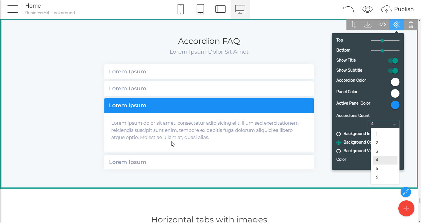
And when it comes to making up a bit more complicated showcases the one page website templates have a few more aces in its sleeve. Just scroll until almost the bottom of the palette and you can find some very useful stuff for FAQ, Legal notices, showcasing different business plans or product implements still drastically saving space and having pretty much tons of info on a single screen not messing up with each other.
What I'm talking about are the accordion and tabs blocks. These easily give you the power to place large amounts of info sharing the same space giving the user the ability to select what comes to be of interest at the present moment not losing time and efforts scrolling through all the rest. Additionally, this whole process comes to be a bit more amusing since some user interaction is required – like a "click to get what you want" thing which once more comes to be one of these tiny things building the big picture.
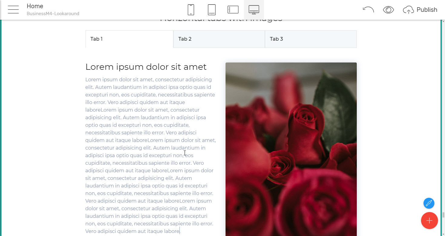
Accordion block provides an easy overview of multiple topics on a single screen while the horizontal/vertical tabs items let you expand this "utilize the same space on screen for a few things" functionality adding the option to also include an image in each element's content. So in case you need to – tabs can also contain article teasers, special offers and generally any kind of content which would look better fortified with an appealing picture aside.
An extra tip: Do note that the image you'll use to replace the initial placeholder will be scaled up/ down in order to fit in width the place taken initially by the placeholder. What this practically mean is that drawing some inspiration from the features blocks with image and text aside in cases where a bit longer texts are to be placed in a tab the image could be chosen Landscape oriented so it more or less spreads equally on screen as the text block aside. In some cases, this is not just convenient approach structuring your content but it looks pretty cool as well.
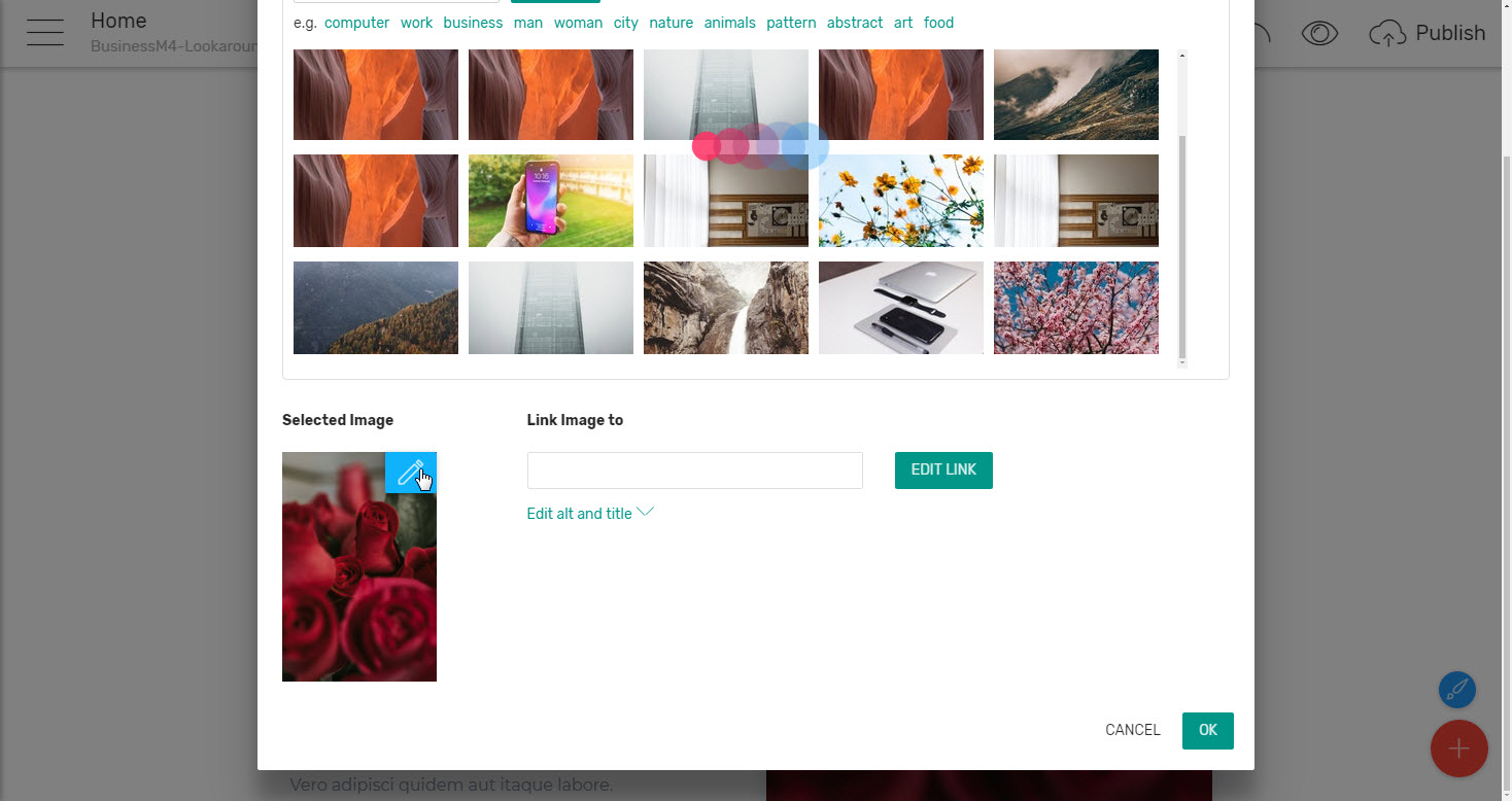
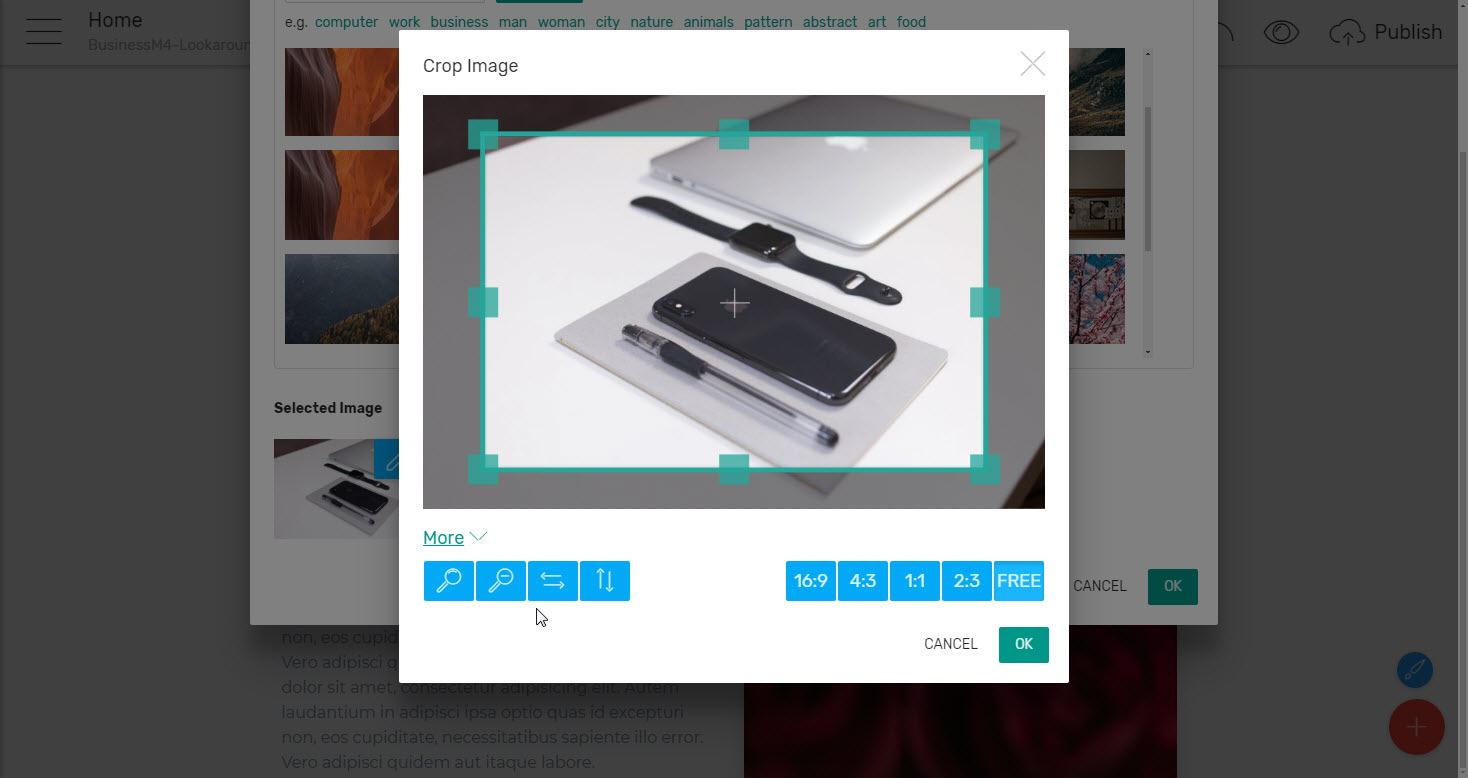
Maybe here comes the time to briefly mention that initially we talked about only regular office working skills are quite enough for creating great pages with Mobirise Builder, but as far as I have noticed there are some people handling perfectly their everyday reports, emails etc. still having some issues when it comes to image cropping and resizing. I suppose that's why in Mobirise Builder this otherwise requiring a third party application process takes part as a functionality built in the Insert Image dialog box.
Just click on the little blue Pen icon in the corner of the selected image and use the easy almost like in Social Networks posts image editing dialog box in order to crop and resize the content in your images showing up what you need exactly the way you need it. There even are some horizontal/ vertical flip options and the most common aspect ratios predefined.
Lives demos: Creative HTML Template, Corporate HTML template for Travel Agency.
