Meet BusinessM4 corporate html5 template - awesome theme for business aims! Part 3.
Don't have quality images right now – just take some from the convenient online library taking place at the top of the very same dialog providing you the option to look up what you need by a keyword or two.
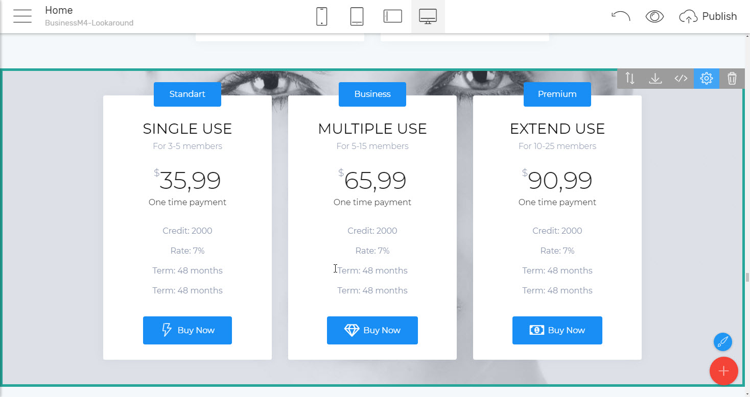
And when it's business we’re talking about at the end of the day it’s often all about the money, right? A properly composed html5 business template should be able to clearly showcase the product, plans, and condition it has for sale to the potential customer. These should be clear and informative, still appealing and with the ability a particular item to be pointed out if needed. That's exactly the purpose
Convenient Pricing Tables Website Templates
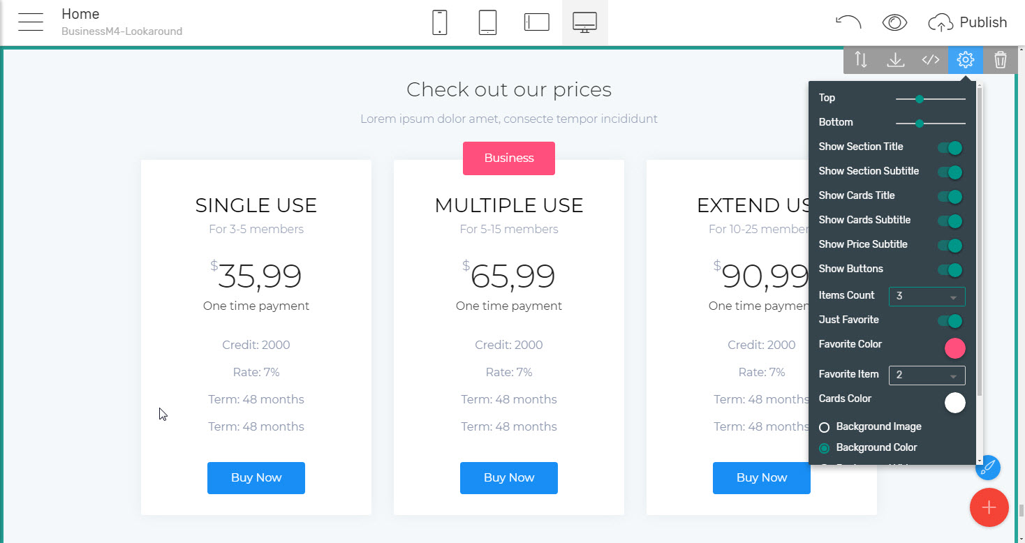
Are also taking part in the BusinessM4 html5 business template. Setting up their number, appearance, if and which item to be standing up is quite easy from the blocks properties panel as usual and in case you happen to be needing a bit more than three options as is the maximum number these blocks are providing, just remember the simple thick we talked about earlier and insert a few more corporate html5 template blocks arranging them to look consistently. Want to have more than three in a row? Well, you, of course, might to but take a look at it this way – in order to actually stand up, be seen and understood it's vital for such items having enough breathing space around. Otherwise, the users might get confused by too many info placed all together and eventually scroll down saying "I'll read it in detail later" than browsing away which is definitely not the effect we need.
Finally but least not in importance
The People
Whatever undertaking the page you are about to build about using the html5 business template, it's been done by people for another people, right? So, especially in today's world of shiny corporations and brand it often helps a lot fiving particular names and faces of common terms like "Our team of professionals" and "Our satisfied clients". It comes to be more and more of importance for the viewer to actually see who he/she will be dealing with and who you have already done business with, what they are saying etc.
That's exactly the goal the Teams and Testimonials sections blocks in BusinessM4 corporate html5 template coming to accomplish.
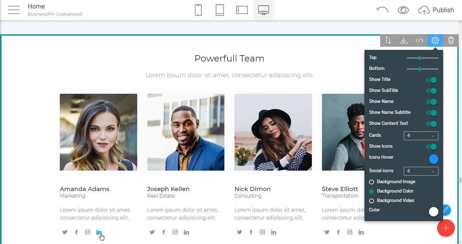
With the Team blocks, you can not only easily present all the significant members of your team, but also give the viewer the ability to one-click contact them using the 21-st century communication way – the social networks – through the convenient icons taking place under each team member's bio. Setting them up is easy as pie – the most popular social networks are already pre-set, like Facebook Twitter, Instagram, and LinkedIn – all you need to is browse to the particular person's profile, copy the link and place it in the icon's Link field. Don't like the predefined icons and what they suggest – just select another icon from the vast library providing more than five thousand icons in various styles for pretty much anything you can think of. The social icons are set to be no more than 4 which in my opinion is quite enough since nevertheless the registrations they have, people rarely maintain and regularly post in more than one or two social networks platforms – it's just too time-consuming to maintain more considering you have something else to do during the day.
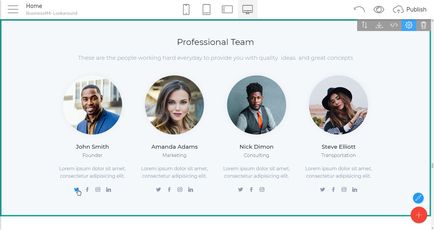
A nifty trick – it might occur you need assigning a different number of social accounts to the members of your team you are showcasing. That's being said assuming you don't make the ones with less make a dummy account to fill in the number of course. There is an easy not requiring code solution as well, nevertheless maybe not so obvious. All you need to do is set the icons and their hover color appearing the same color as the block's background so it gets invisible. This will work nicely but personally – I would have rather narrowed the number of social networks for all the members instead maintaining a consistent appearance of
A few words aside for the Icons extension which gets used for properly setting up the team members profiles. It’s far more than just an addition to the Teams Template for Business Website included in the corporate html5 template. Actually, you can use it to insert an icon from the library mentioned pretty much all over your project – for example using it you can easily change any icon in the features with icons blocks, insert an icon in pretty much any menu you have in your project and in each button as well.
Regarding the particular team member's bio layouts two different appearances has been presented – with either person's pictures rounded in circle, like it's now trendy to show up profile pictures in the social networks and in the far most traditional square if it's a bit more conservative looks you are after. There is a little trick below the surface actually – on subconscious level the round and symmetrical forms imply stability and trust, so even the shapes chosen themselves are working for you building the trust in your team and brand. The round pictures are my personal preference here since it's real life people we're talking about, like individuals with characters which are actually more than just employees on positions, so the round kind of fits better getting them outside of the box.
Another way to showcase the results of your interaction with the Community and the results you have already achieved is
Sharing your client's words
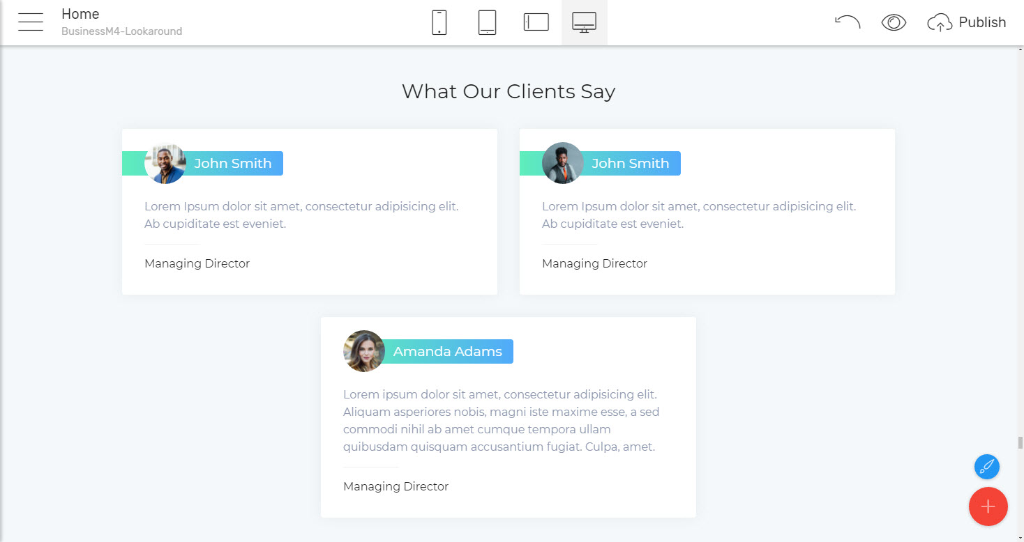
This gets done as easy as presenting your team and following pretty much the same layout. This time the focus is set not so much on seeing who's talking but rather on what they have to say. That's why the Client images and names are rather as they would be in a Facebook or Instagram post (and this resemblance is intentional I think) leaving enough space for what’s really important – the feedback, thoughts and opinions they have to share about doing business with you. The experienced Mobirise Builder user might notice the missing testimonials slider in the html5 business template but it's not needed actually since you can easily grab it form the default Mobirise 4 corporate html5 template if so desperately in need for it. As I see it the BusinessM4 html5 business template rather aims for a bit clean appearance (also easing the browser's load times) and maybe this is the reason the Testimonials Business Website Template slider has been omitted.
Feedbacks form partners are really important, but in some occasions, it comes to be more important to
Set the focus on the brands
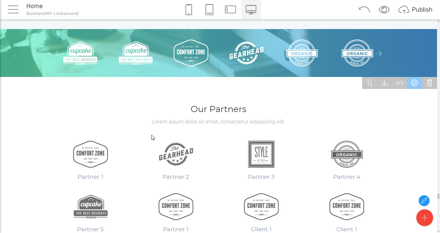
You've been working with as well. Truth is when browsing briefly to get initial impression of who you are and what you're doing the visitor is likely to skip that one of your feedback some form the CEO of HP for example but won't probably miss the HP logo if it's somewhere in the Partners or Clients section. That's just the way things are the mind perceives images faster and easier than text, so shapes and logos are getting noticed much easier and of course if seen before – much faster recognized and recalled. So, having some logos of the brands you work with is rather good thing to do. In Business M4 you can do it with ease utilizing one of my favorite blocks – the logo slider. What it is in its essence is an image slider containing a few boxed in layout images on single screen. In order to fit, they are of course a bit smaller which in turn, combined with transparent image background is just perfect for showcasing some brands in limited space. There is actually more potential in this block than the eye initially see since along with showcasing just brand images it can be easily set up to present some products or services for example. Each item is handled by the image processing dialog in Mobirise Builder, meaning you can change the image or assign a live link to it by a single click, so as well as beautiful this mini slider can be quite functional turning out into a mid-page navigation element for example.
Additionally, if you insist having them all seen at all times, along with a few words about each one, you can easily use the next html5 business template block which presents all the logos in a plain table – like layout which in turn can be easier for the more conservative visitors to get. I guess it all depends on the particular vision and concept and audience you are after.
Now, after we have discussed the brands - back to the people. And when it’s people we're talking about, it's also important
Getting them easy to pay you a visit
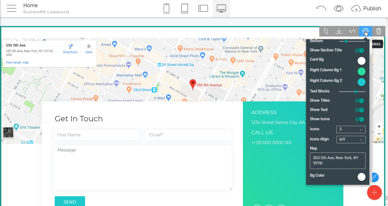
Since the web is cool and convenient, yes, but when things start getting serious many, including myself prefer meeting the ones they are about to spend money and efforts with in person. Taking care of this with BusinessM4 html5 business template is easy as well due to the convenient Google Maps blocks it also has waiting in the palette. Actually some of these blocks are composed in a way expanding their map functionality further cleverly utilizing the space available on screen accordingly. Here is what I mean – remember the forms we talked about earlier? The ones you just need to put your email in and have the submissions sent to you? Well imagine that – alongside with the classical full width Maps and Forms Business Website Template block, you can place on your business pages, there is one creatively combining a map high enough for the visitor to get the impression where the location is, and an information card overlapping it in a fresh and cool way. Inside this card we can find an info area for clearly stating address, phones or any other vital info you might have to share, some iconic links ( which along with social networks profiles can be used for direct links like phone call, email etc.) and one of these cool forms the visitor can use to message you directly. All of this is sharing the same space, not interfering with each other also looking beautiful and trendy.
As you might probably noticed in the image above – the address is just defined as you would regularly have written it down while looking for it in Google maps. Just doing that is quite enough for the application to do the heavy lifting and place the location pin where it should be. Secret labs in the desert owners shouldn't be concerned as well – in case you don't have a particular street/ number address pasting the GPS coordinates in the Map field works great as well.
This particular layout – one item slightly overlapping another, breaking up the conventional arrangement and creating a subtle three-dimensional effect is so cool still easy and light for the browser to render and actually comes to be one of the new stuff I see in the M4 themes family for the first time. And since the blocks from in all of them are compatible with each other – the block can be used and due to its clean universal appearance will fit in practically any page. That's one of the reasons I love working with Mobirise Builder so much – the whole project constantly evolves introducing clever new appearances in each html5 business template.
Now – back to the BusinessM4 corporate html5 template. I guess we looked over pretty much all of it except for maybe the
Cool and clever Menu Business Website Templates and footers
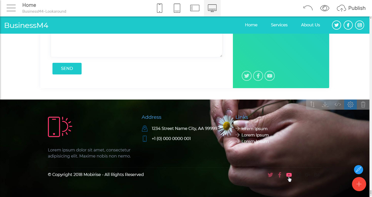
it also has to offer. Easily underestimated the footer generally doesn't stand up much with looks and effects but actually comes to be a vital part of every page due to its unique purpose and the relative freedom of setting up it's layout comparing it to the other navigational element of the page – the header of so called Navbar.
Both of these are holding the page's structure and are the ones we all turn to when we need to get around. But while the Navbar, even when set to be always taking place on top of the page is always limited in height (it's not supposed to be covering much of what's to be said on page), the Footers Business Website Template comes last and can spread a bit more loosely, which in turn means – more space for useful info, links terms and conditions and actually – any information that is vital for you to be taking place on a predictive location on all of your pages. One of the eases the Mobirise Builder grants are the so called global blocks and I'll tell you why I'm mentioning them here right away. Imagine you have already crafted more than a half of your web design project – like set up the navbar and footer links, created, let's say ten pages and more or less filled them up with content business website templates when for a reason a structure change I your project is inevitably needed. Why inevitably and why web designers in general are trying to figure out the structure in the beginning than avoiding any changes to it if possible? Generally, because any change of the structure of a project should be properly reflected in the way this structure is being described – I mean all around in any element which is being used for navigating through the site, which in our example would have meant 10 pages with a header and footer each – et least 20 elements to be edited and in a boring and a time-consuming manner. That's what it would regularly be like.
And exactly here is the place where the Mobirise Builder Global corporate html5 template blocks are coming to an aid. As you have probably already figured out by the name and the story just been told what Global blocks do is changing globally all over the project once one instance of the block has been edited. On other words if you need to change the site structure from the above example in a Mobirise Builder project you would need to do not 20 but just two edits – one to the Navbar and one to the Footer of any of the page – all the rest will change on their own! This great behavior goes for all navigation and footer blocks in Mobirise Builder themes, including of course BusinessM4 back from the previous third version and since there is also a strong Community forming around the Mobirise Project, I think I have actually seen quite a few example implements in the Community forum – just look them up.
Now here is a thing – what to do if we need some of the pages in our project having particular Navbar/ Footer, and the rest – a bit different ones? What should be done in this case and is it actually achievable? Truth is, this can also be done but in a bit not so obvious way. To have two different kinds of global elements, just remove the those you'll already have inserted when you create a new page and insert different ones from the Blocks Palette. Then when you just duplicate the page with the needed global blocks combo and fill it up with the new content needed – the result will be a project consisting of pages with two sets of header/footer pairs, each one changing independently but globally upon edit – as easy as that!
Final words
Well I guess that's the way our look over the BusinessM4 html5 business template for Mobirise Mobile Web Builder comes to its end. Looking back at the corporate html5 template once again I think if there were two words to describe it these would be clean and appealing. I would maybe also used beautiful but considering this kind of pure beauty coming up from the balance in ordering, a beauty where you don’t feel any effort in understanding what is what looking at it and all things just seem to be in place.
BusinessM4 html5 business template doesn’t stand up with massive visual effects, bold colors and shouty captions, at least the way it has been initially designed. It’s a Mobirise Builder html5 business template after all so if you really need to have such you can easily make them your own but my advice would be not to since I think it will spoil the whole well thought corporate html5 template concept. If you need modern and bold – go for Commercem4 or StoreM4, if you need it more warm and playful – RestaurantM4 is your theme, beautiful, welcoming and luxury – HotelM4 and if your need creative and bold again – LawyerM4 and PortfolioM4 are the ones.
BusinessM4 corporate html5 template is rather serious but without bothering the viewer taking itself serious too much. It's for showcasing quality by its features and letting it shine on its own which, I think, especially in today's world full of shiny commercials is rather pure gold. Serious people aiming for serious business have probably seen (and maybe used) all the common tricks so many times so what could possibly catch their attention is nothing more or less but a light, clean and straightforward showcase.
That's what I think.
For the experienced Mobirise Builder user the BusinessM4 will most certainly shine with the innovative layouts it has to show. Layouts, which due to the html5 business template's clean neutral design are likely to fit in pretty much any project, so along with standalone solution the corporate html5 template comes to be a great extension library to the M4 themes family as well.
And to the novice users, still chewing up the info there is such thing as web builder for the common folk I say – Don’t be afraid trying out whatever gets to your mind! Feel free to experiment and see what will work and what will not for you since there isn't better teacher than practice and some will probably get amazed just how easy actually the pages get built. Be warned however – this whole thing is extremely addictive – you'll most probably end up creating web pages and enjoying it!
Happy designing!
