
 Chevrolet Camaro
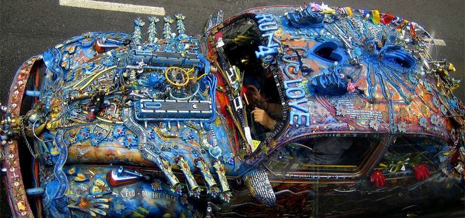
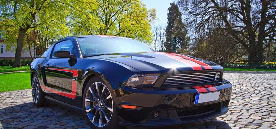 is an automobile manufactured by the Ford Motor Company
 1958 Classic
This slider is now avalable with our AI Website Builder!
This easy web design software comes with 9900+ awesome website blocks: image galleries, lightboxes, image sliders, bootstrap carousel, counters, countdowns, full-screen intros, features, data tables, pricing tables, progress bar, timelines, tabs, accordions, call-to-action, forms, maps, social blocks, testimonials, footers, and more... Free for commercial use.
More Demos
-
 wordpress slideshow
Galaxy Template
with Turn Transition
-
 jquery content slider
Stream Style
with Fly Effect
-
 jquery photo gallery
Strict Template
with Photo Transition
-
 slideshow jquery
Salient Design
with Squares Transition
-
 jquery slider css
Elemental Template
with Slices Effect
-
 wordpress gallery css
Shady Layout
with Stack vertical Transition
 Recent Questions
More Demos: Bootstrap carousel, Slick slider, Bootstrap slider, HTML slider, Slick carousel, Bootstrap carousel, HTML slideshow, CSS Slideshow, jQuery carousel, Image carousel
 Wordpress Gallery Plugin - Design it yourself!
To design the outstanding WP Gallery Plugin like this, watch this video instruction here:
 Demo: Wordpress Gallery in Action!
In this video you can see the excellent Wordpress Image Gallery in Action!
 Wordpress Gallery Plugin HTML Code
Code to paste between the tags <head></head>:
<!-- Start WOWSlider.com HEAD section -->
<link rel="stylesheet" type="text/css" href="engine1/style.css" />
<script type="text/javascript" src="engine1/jquery.js"></script>
<!-- End WOWSlider.com HEAD section -->
HTML code to paste between the tags <body></body> in the place that you want the Wordpress Gallery Plugin to appear:
<!-- Start WOWSlider.com BODY section -->
<div id="wowslider-container1">
<div class="ws_images"><ul>
		<li><img src="data1/images/audi87448_1280.jpg" alt="Audi A7" title="Audi A7" id="wows1_0"/></li>
		<li><img src="data1/images/car101975_1280.jpg" alt="Yellow Car" title="Yellow Car" id="wows1_1"/>Chevrolet Camaro</li>
		<li><img src="data1/images/crazy57942_1280.jpg" alt="Overpainted Wolksvagen" title="Overpainted Wolksvagen" id="wows1_2"/></li>
		<li><img src="data1/images/ford64041_1280.jpg" alt="Ford Mustang" title="Ford Mustang" id="wows1_3"/>is an automobile manufactured by the Ford Motor Company</li>
		<li><img src="data1/images/pontiacbonneville78259_1280.jpg" alt="Pontiac Bonneville" title="Pontiac Bonneville" id="wows1_4"/>1958 Classic</li>
	</ul></div>
	<div class="ws_bullets"><div>
		<a href="#" title="Audi A7"><span><img src="data1/tooltips/audi87448_1280.jpg" alt="Audi A7"/>1</span></a>
		<a href="#" title="Yellow Car"><span><img src="data1/tooltips/car101975_1280.jpg" alt="Yellow Car"/>2</span></a>
		<a href="#" title="Overpainted Wolksvagen"><span><img src="data1/tooltips/crazy57942_1280.jpg" alt="Overpainted Wolksvagen"/>3</span></a>
		<a href="#" title="Ford Mustang"><span><img src="data1/tooltips/ford64041_1280.jpg" alt="Ford Mustang"/>4</span></a>
		<a href="#" title="Pontiac Bonneville"><span><img src="data1/tooltips/pontiacbonneville78259_1280.jpg" alt="Pontiac Bonneville"/>5</span></a>
	</div></div>
<div class="ws_shadow"></div>
</div>
<script type="text/javascript" src="engine1/wowslider.js"></script>
<script type="text/javascript" src="engine1/script.js"></script>
<!-- End WOWSlider.com BODY section -->
 SEVEN EFFECT & GRAFITO STYLE WORDPRESS GALLERY PLUGIN
This gallery has an old-fashioned elegance and an unusual color scheme. The result is very unique and eye-catching!
There is no frame effect to the slides, allowing the pictures to take up the maximum amount of space. However, the images do have a 'rounded corner' effect, which makes them look like old-fashioned photographs.
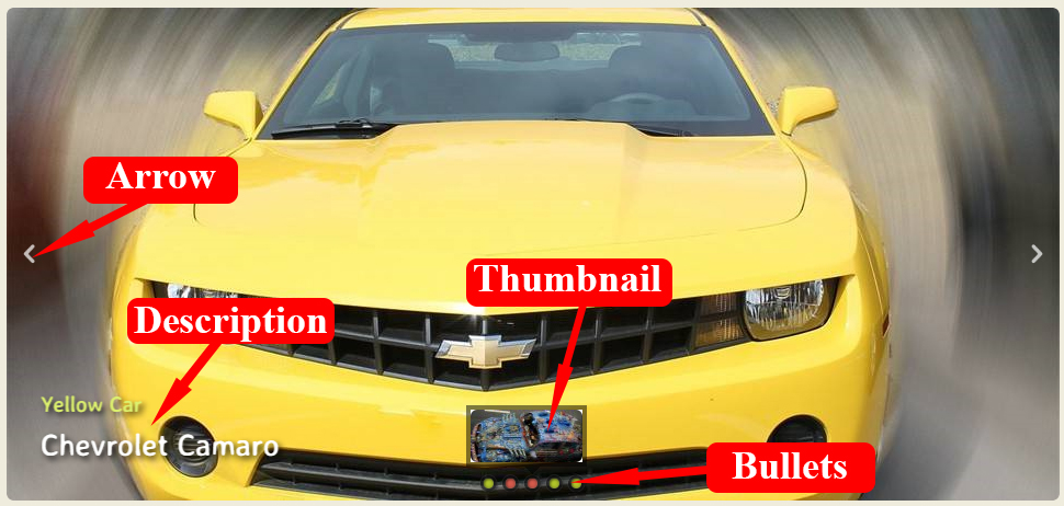
The navigation arrows appear when you over over the slider, and are white, semi-transparent arrowheads with a drop-shadow to help them stand out. Hovering over an arrow turns it a slightly faded orangey-red, an unusual color in web-design, but which really helps reinforce the 'old fashioned' feel.
Clicking on the arrow cycles you through the slides.
At the bottom-center of the gallery are a series of yellow-green dots with a black border and 'drop shadow' effect which represent each slide in the slideshow. When the dot related to the current slide is highlighted, it turns the same faded red as the navigation arrows. The green and red together is really eye-catching.
Hovering over a dot brings up a small preview of the relevant slide in a black semi-transparent frame.
The caption sits in the bottom-left corner. There is a small title in a yellow-green color, with an optional white larger sub-title below. The text has a dark drop-shadow, which helps it stand out against the images as it has no colored background.
The font used is Averia Sans Libre, a unique font that was created from the average of many other fonts. It has a fun and slightly hand-drawn look to it, which complements the quirky but old-fashioned feel of the gallery well.
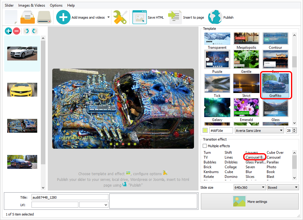
There are a number of change effects to choose from, but the default 'seven' has the image break apart in squares and fly off the screen, whilst the next image forms from squares flying in from the other side of the screen. It's a good, fun choice that complements the quirky design of the gallery and has a lot of movement to attract the eye. If you wanted to play up the old-fashioned feel a bit more, 'kenburns' would be a good choice as it fades the photographs into each other, or you could use 'book' which simulates turning a page in a book.
This gallery would be perfect for anyone with a vintage or retro site design. 'Mommy bloggers' would love this, as it would work well with a 1950's vintage 'house-wife' vibe. The gallery would also work well for sites that discuss the history of buildings, towns or people, particularly if they have old photographs to display. Antique dealers would also benefit from the quirky, old-school design.
 Comments
Greetings, WowSlider team. I've downloaded the Windows version to see if I can use it on my website. I've been using Flickrit to embed a gallery in my web page but they've changed some parameters so I need to find a new solution.
Yours does not grab the data right from Flickr but rather imports it and saves it to a folder that I need to leave on my website - I can work with that
If this will work for me I'll certainly by a server license but I'm still having a few issues that I can't find answers to on your site.

1. This is really important to me. I see that when I upload, by default I leave unchecked “load full description”. When I do this I get the photo “titles” in the text bars on the screens – looks great. But what I really need is a two-line display:
Line 1: Photo Name (from Flickr – the text that appears when I leave “load full description” unchecked),
Line 2: Photo Description (from Flickr – the text that appears when I check the “load full description” box).
IS IT POSSIBLE to have a template that will pull data from both of these fields? Here is an idea of what I’m trying to achieve (see Flickr image on right, with both metadata fields shown in upper text region):
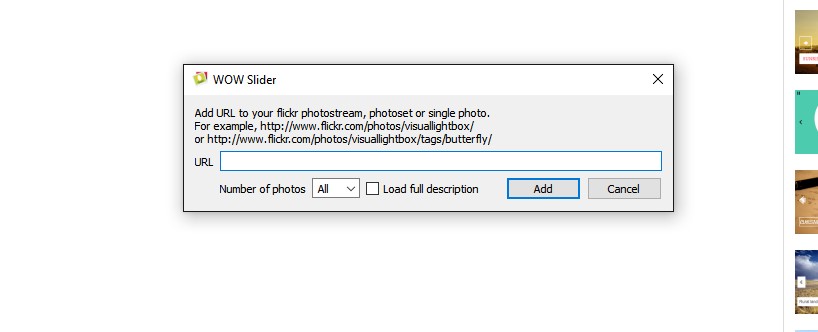
2. When I open a new project and choose to add images from Flicker I enter my album URL and then get this message (below). Occasionally it works, usually not – any ideas?
Unfortunately importing images from flickr albums is not supported in the WOW gallery app. You can take images from the flickr photostream for your slide show and insert descriptions from flickr manually. I'll send a request to our developers regarding these issues you're having.
It's neat that the application does grab the Flickr descriptions and the picture names. A check box in your settings ("load full description") cleanly picks one or the other before the import. It would simply be nice to have an option to grab and show both - the picture name and the full description.
I'm not referring to a live connection to Flickr, this is all data that is brought with the imported pictures.
I also have challenges doing the actual import sometimes. More often than not I get an error box. Then it seems to work after enough tries - really weird. Again, this is when I try to import from the Flickr album link.
I'll pass your query along to our developers. We'll try to fix it in the future.
Been digging deeper with this. I've found some templates that actually seem to do what I need - STRICT is one. It might pull the separate data - photo name and photo description - and put them on separate lines. (Unfortunately the application still sporadically generates errors when downloading Flickr Album photos so I can't fully test this yet...
So this is closer to what I need, but begs more questions...
In Strict, for example, there is a Title line and a Description line. There is only one area where I can choose font type and size. So is it built such that I choose the font and size for the Title line, and you will auto-resize the Description line with the same font using a percentage of the Title line's font size?
Is there anyway to preview the actual slideshow, or even just one slide with the description overlay? Currently the only way I can evaluate the look of the slide descriptions is to publish the project first. It would be nice to have a "preview" button that would show what the actual published version will look like.
1. Yes, it supposed to use one and the same font fot Title and Description. And the size of the Description set automatically using a percentage of the Title line's font size. The only way to change it is to edit code of the published page manually.
2. There is preview at the app, but probably it was turned off because of using a too many images.
Try to turn on the preview (Options -> Show preview - set this option checked).
Thanks. The biggest problem I've run into - one that I can't really work around - is that occasionally I simply cannot download my Flickr album to Wow. Sometimes it works right away, other times (like yesterday afternoon and today) I get an error. I'm using the same link every time, from the same computer in the same office
We've already sent a request on your problem to our developer team.
I have a paid version of Wowslider for my business website. I use Yahoo Sitebuilder for webhosting and Internet Explorer on the laptop I am using to publish my site.
I have built a gallery and when I publish it (the gallery has 7 images) only five of the seven show up as pictures....the other two are blank but have an "x" in the upper lefthand corner. Could you please tell me what I'm doing wrong?
Make sure that you've upload all the images to the server.
Just trying 7.6 and the basic slide effect on the title and description is overshooting to the right before flicking back to the centre, which doesn’t look right. Can’t see why this is happening?
Send us the project (.wowsl) so we could check it.
I have sent the report to our developer team. They'll try to fix the problem in the next version.
 wp gallery slider
 gallery plugin wordpress
 wordpress gallery free plugin
 image gallery plugin html
 free gallery plugin wordpress