This slider is now avalable with our AI Website Builder!
This easy web design software comes with 9900+ awesome website blocks: image galleries, lightboxes, image sliders, bootstrap carousel, counters, countdowns, full-screen intros, features, data tables, pricing tables, progress bar, timelines, tabs, accordions, call-to-action, forms, maps, social blocks, testimonials, footers, and more... Free for commercial use.
More Demos
-
 full width slider
Cursive Style
with Collage Transition
-
 image carousel
Book Style
with Dribbles Animation
-
 javascript gallery
Megalopolis Layout
with Slices Effect
-
 javascript slider
Ionosphere Design
with Stack Animation
-
 responsive slider
Chess Template
with Blinds Animation
-
 html slideshow
Silence Skin
with Blur Effect
 Recent Questions
More Demos: Bootstrap carousel, Slick slider, Bootstrap slider, HTML slider, Slick carousel, Bootstrap carousel, HTML slideshow, CSS Slideshow, jQuery carousel, Image carousel
 Responsive CSS3 Image Slider in minutes!
With WOW Slider software you can build responsive CSS3 Image Sliders like this!
 Photo slideshow on the page!
Here you can see versatile transition effects you can use in your own slideshow!
 CSS3 Image Slider HTML Code
Code to paste between the tags <head></head>:
<!-- Start WOWSlider.com HEAD section -->
<link rel="stylesheet" type="text/css" href="engine1/style.css" />
<script type="text/javascript" src="engine1/jquery.js"></script>
<!-- End WOWSlider.com HEAD section -->
HTML code to paste between the tags <body></body> in the place that you want the CSS3 Image Slider to appear:
<!-- Start WOWSlider.com BODY section -->
<div id="wowslider-container1">
<div class="ws_images"><ul>
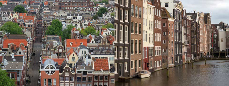
<li><img src="images/demo/book-book/data1/images/amsterdam.jpg" alt="Amsterdam, the Netherlands" title="Amsterdam, the Netherlands" id="wows1_0"/></li>
<li><img src="images/demo/book-book/data1/images/delft.jpg" alt="Delft, the Netherlands" title="Delft, the Netherlands" id="wows1_1"/></li>
<li><img src="images/demo/book-book/data1/images/giethoorn.jpg" alt="Giethoorn, the Netherlands" title="Giethoorn, the Netherlands" id="wows1_2"/></li>
<li><img src="images/demo/book-book/data1/images/belgium.jpg" alt="Bruges, Belgium" title="Bruges, Belgium" id="wows1_3"/></li>
<li><img src="images/demo/book-book/data1/images/bruges.jpg" alt="Bruges, Belgium" title="Bruges, Belgium" id="wows1_4"/></li>
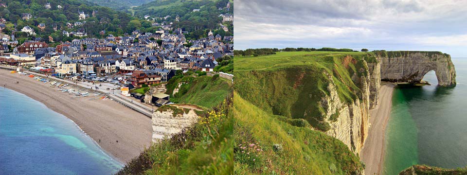
<li><img src="images/demo/book-book/data1/images/etretat.jpg" alt="Étretat, France" title="Étretat, France" id="wows1_5"/></li>
<li><img src="images/demo/book-book/data1/images/france.jpg" alt="Étretat, France" title="Étretat, France" id="wows1_6"/></li>
</ul></div>
<div class="ws_bullets"><div>
<a href="#" title="Amsterdam, the Netherlands"><img src="images/demo/book-book/data1/tooltips/amsterdam.jpg" alt="Amsterdam, the Netherlands"/>1</a>
<a href="#" title="Delft, the Netherlands"><img src="images/demo/book-book/data1/tooltips/delft.jpg" alt="Delft, the Netherlands"/>2</a>
<a href="#" title="Giethoorn, the Netherlands"><img src="images/demo/book-book/data1/tooltips/giethoorn.jpg" alt="Giethoorn, the Netherlands"/>3</a>
<a href="#" title="Bruges, Belgium"><img src="images/demo/book-book/data1/tooltips/belgium.jpg" alt="Bruges, Belgium"/>4</a>
<a href="#" title="Bruges, Belgium"><img src="images/demo/book-book/data1/tooltips/bruges.jpg" alt="Bruges, Belgium"/>5</a>
<a href="#" title="Étretat, France"><img src="images/demo/book-book/data1/tooltips/etretat.jpg" alt="Étretat, France"/>6</a>
<a href="#" title="Étretat, France"><img src="images/demo/book-book/data1/tooltips/france.jpg" alt="Étretat, France"/>7</a>
</div></div>
<div class="ws_shadow"></div>
</div>
<script type="text/javascript" src="images/demo/wowslider.js"></script>
<script type="text/javascript" src="images/demo/book-book/engine1/script.js"></script>
<!-- End WOWSlider.com BODY section -->
 BOOK EFFECT & BOOK TEMPLATE CSS3 IMAGE SLIDER
This slider mimics the look and feel of an old book. Skeuomorphism is not often seen in slider design, which makes this one quite different and eye-catching.
The slider is also quite different in that it shows two images at once, on opposite ‘pages’. This means the slider works exceptionally well for square images, unlike most sliders which are designed to work with landscape images. The two slides are linked under a single caption, so you need to make sure your images work together in pairs. It’s fantastic for showing a single product in two different ways, for example a wide-angle view that shows the whole image, and then a close up of a detail.
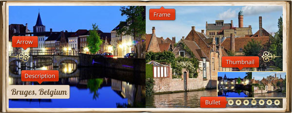
The slides appear within a ‘cover and pages’ frame, that looks like an antique, leather-bound book. Hovering over the slider brings up two very ornate, golden navigational arrows, one on each side. These arrows enable you to click through the pages, or return to a previous page.
There is a caption in the bottom left corner. This emerges directly from the ‘page’ frame, and the background is the same color. This means the caption feels like part of the book, and reinforces the realistic effect.
The font used is Lobster. This is a fantastic font, that uses multiple versions of letters and ligatures to create a joined-up, handwritten effect that is extremely natural and realistic. A subtle ‘embossing’ effect finishes the lettering, making it feel both handwritten and sophisticated, like the embossed letters on a hand-bound journal.
At the bottom right is a series of circles, each one representing a slide. The same care and attention has been shown to these circles, and each one feels like an antique golden button, with a centre dot that has been ‘stamped’ out, thanks to slightly irregular edges. When the current slide is highlighted, the button-hole contracts slightly.
Hovering over the buttons brings up a preview of each set of slides, contained within a gold frame, and with a slight drop-shadow behind. You can use the buttons to jump to different slides.
The combination of realistic leather, embossing and drop-shadows makes this slider feel realistic and touchable. It would work well on touch-screens, thanks to the way it invites you to touch the pages.
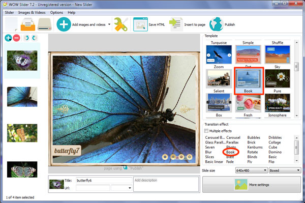
The default change effect is the perfect one, as it mimics the turning pages of a book. Whilst you do have a choice of transition effects, the ‘book’ really does work exceptionally well with the slider design.
This slider is perfect for anyone who wants to mimic an expensive, old-fashioned feel. Antique dealers, fantasy authors, and anyone who sells hand-made products would benefit from using this slider.
 Comments
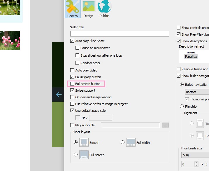
We have ordered your wowslider. However, we found that the full screen icon cannot display in iphone. Could you advise how we can solve it?
Sorry for the inconvenience. We'll try to fix this issue later.
May I know how we can solve it? We need to provide to our customer. And also, may I know is it possible to custom a function icon in the slider? Such as help icon.
Sorry, we don't know when it will be resolved. Unfortunately, buttons aren't supported.
The fullscreen issues is very critical, this function is very important and we need to provide to our customer soon. Could you fix it immediately?
Please try to add this line to the head section of your page:
<meta name="viewport" content="width=device-width, initial-scale=1">
We have some trouble to view the slider in mobile. It cannot fullscreen and the height cannot 100%.
It looks like the problem caused by the line above <!DOCTYPE html>.
May I know do you have any update?
The last update was Jan 22, 2016 WOWSlider v8.7 You can find more information about updates and other in our site: http://wowslider.com/.
But I still cannot see the full screen button and the height cannot 100%
Heigh cannot be 100% because the slider is horizontally oriented and so it cannot have 100% height and save aspect ratio at the same time.

Can I still upgrade ?? I must have missed this email as it was in my SPAM folder. I only came across it as I have El Capitan and need to change the sliders I have created.
It seems you've already ordered new WOWSlider. Is your issue still actual?
No .. its ok. Back up and working now. Had one question .. is it possible to create image maps on each image .. links from different buttons etc? I know that you can link a slide to a page, but it would have been great if you could link different zones to different pages.
Unfortunately, it isn't supported in our app.
May I please have assistance with changing the coding of my Wowoslider. I am using Xara for designing and need to place my navigation bar, logo and a rectangle on top of the Wowslider. The Slider appears on top of these items regardless of what I do. I have supported a support ticket with Xara and below is their response. "Your code in the wowslider has a z-index of 90, which means it's designed to be on top of everything on the page. You'll have to either edit the code so that it's behind everything or move your bar above it." May I please have assistance with this as I have no idea what it means.
Please, send us the link to your web page with the inserted slider and navigation bar so we could check it.
Please, open generated style.css file in any text editor and find the code:
#wowslider-container1 {
    box-sizing: content-box;
    display: table;
    font-size: 10px;
    margin: 0 auto;
    max-height: 500px;
    max-width: 100%;
    position: relative;
    text-align: left;
    text-shadow: none;
    width: 100%;
    z-index: 90;
}
#wowslider-container1 {
    box-sizing: content-box;
    display: table;
    font-size: 10px;
    margin: 0 auto;
    max-height: 500px;
    max-width: 100%;
    position: relative;
    text-align: left;
    text-shadow: none;
    width: 100%;
    z-index: 0;
}
Thanks, this works. Your are a star.
I have created the slideshow using wowslider and the websie was designed using Xara webdesigner. On my browser it appears correct...full width but on different browsers it appears with a gap on the left hand side. What am I doing wrong?
Unfortunately, your page is not available. Please check it.
I have since removed it because the client wanted the site to go live and I couldn't wait anymore. I will create another one and advise.
I am experiencing the same problem as above. I have attached the screen. The slideshow is not full width, Please help.
Your slider is in a div that has a fixed size, so your slider has the size of this block.
I think it's the way it works in Xara.
You can remove the size properties of this div, or you can move your slider's code.
Open your .html file in a text editor:
<div class="xr_strb  xr_mvp_1 " style="top: 0px; left: 0px; width: 100%; min-width: 1120px; position: absolute;">
<div class="xr_noreset " style="position: absolute; left: 1px; top: 0px; width: 1119px; height: 460px;">
<!-- Start WOWSlider.com BODY section -->
...
<!-- End WOWSlider.com BODY section -->
</div>
</div>
<!-- Start WOWSlider.com BODY section -->
...
<!-- End WOWSlider.com BODY section -->

<div class="xr_strb  xr_mvp_1 " style="top: 0px; left: 0px; width: 100%; min-width: 1120px; position: absolute;">
<div class="xr_noreset " style="position: absolute; left: 1px; top: 0px; width: 1119px; height: 460px;">
</div>
</div>




 1
1 2
2 3
3 4
4 5
5 6
6 7
7