This slider is now avalable with our AI Website Builder!
This easy web design software comes with 9900+ awesome website blocks: image galleries, lightboxes, image sliders, bootstrap carousel, counters, countdowns, full-screen intros, features, data tables, pricing tables, progress bar, timelines, tabs, accordions, call-to-action, forms, maps, social blocks, testimonials, footers, and more... Free for commercial use.
More Demos
-
 bootstrap carousel
Bootstrap Style
with Shift Animation
-
 slider html
Twist Theme
with Glass Parallax Effect
-
 simple jquery slider
Gentle Template
with Basic linear Transition
-
 web photo gallery
Subway Template
with Basic Effect
-
 jquery image scroller
Prime Time Theme
with Basic linear Effect
-
 slider demo
Mellow Template
with Blast Animation
 Recent Questions
More Demos: Bootstrap carousel, Slick slider, Bootstrap slider, HTML slider, Slick carousel, Bootstrap carousel, HTML slideshow, CSS Slideshow, jQuery carousel, Image carousel
 How to make this Responsive Slider?
 How does this responsive image slider look on the page?
 jQuery Responsive Slider HTML Code
Code to paste between the tags <head></head>:
<!-- Start Responsive Slider HEAD section -->
<link rel="stylesheet" type="text/css" href="engine1/style.css" />
<script type="text/javascript" src="engine1/jquery.js"></script>
<!-- End Responsive Slider HEAD section -->
HTML code to paste between the tags <body></body> in the place that you want the responsive slideshow to appear:
<!-- Start Responsive Slider BODY section -->
<div id="wowslider-container1">
<div class="ws_images"><ul>
		<li><img src="data1/images/airplane.jpg" alt="Landing of airplane" title="Landing of airplane" id="wows1_0"/>Brisbane, Australia</li>
		<li><img src="data1/images/bridge.jpg" alt="Bridge" title="Bridge" id="wows1_1"/>Brisbane, Australia</li>
		<li><img src="data1/images/cityscape.jpg" alt="Amazing cityscape" title="Amazing cityscape" id="wows1_2"/>Brisbane, Australia</li>
		<li><img src="data1/images/fireworks.jpg" alt="Bright fireworks" title="Bright fireworks" id="wows1_3"/>Brisbane, Australia</li>
		<li><img src="data1/images/lasershow.jpg" alt="Fantastic laser show" title="Fantastic laser show" id="wows1_4"/>Brisbane, Australia</li>
		<li><img src="data1/images/sunrise.jpg" alt="Sunrise" title="Sunrise" id="wows1_5"/>Brisbane, Australia</li>
		<li><img src="data1/images/quay.jpg" alt="Quay" title="Quay" id="wows1_6"/>Brisbane, Australia</li>
	</ul></div>
	<div class="ws_thumbs">
<div>
		<a href="#" title="Landing of airplane"><img src="data1/tooltips/airplane.jpg" alt="" /></a>
		<a href="#" title="Bridge"><img src="data1/tooltips/bridge.jpg" alt="" /></a>
		<a href="#" title="Amazing cityscape"><img src="data1/tooltips/cityscape.jpg" alt="" /></a>
		<a href="#" title="Bright fireworks"><img src="data1/tooltips/fireworks.jpg" alt="" /></a>
		<a href="#" title="Fantastic laser show"><img src="data1/tooltips/lasershow.jpg" alt="" /></a>
		<a href="#" title="Sunrise"><img src="data1/tooltips/sunrise.jpg" alt="" /></a>
		<a href="#" title="Quay"><img src="data1/tooltips/quay.jpg" alt="" /></a>
	</div>
</div>

<div class="ws_shadow"></div>
</div>
<script type="text/javascript" src="engine1/wowslider.js"></script>
<script type="text/javascript" src="engine1/script.js"></script>
<!-- End Responsive Slider BODY section -->
 Responsive slider jQuery free download
This jQuery slider has a simple, clean and very modern design, that uses black and white.
The main jquery slideshow has no frame or border, but it has a shadow below the slider responsive which helps lift it up from the website background and give it some depth.

Hovering over the slider lets two navigational arrows appear, one on each side. The arrow consists of a white arrow head with a black semi-transparent circle outlined with a thin white border. Hovering over the arrow makes the arrow stand out more with its less transparency. Clicking on an arrow cycles you through the images.
There is a caption in the left corner at the responsive slideshow bottom. The white description on a black rectangle is called the main title that shows up directly from the slider edge. The main title slides into its place from any direction. The responsive jQuery slider ‘bounces’ a little at the end of the motion, which makes the movement feel very natural and organic.
The sub-title is black description on a white rectangle, that shows up directly from the side of the slider. Again, the sub-title slides into place from any direction, with the same little ‘bounce’ at the end.
The font used is ‘Play’, a minimalistic sans-serif font with a very modern look. The use of rounded squares makes it look almost futuristic. Overall, the letters are large and open, helping the text remain very legible.
Down the image slideshow right side are a series of square preview images, stacked vertically. Each one has a thick white border. When the preview image linked to the picture currently on display is highlighted, the border turns black. Hovering over the preview images scrolls through them. Clicking on a preview image allows you to navigate directly to the picture you want to look at.
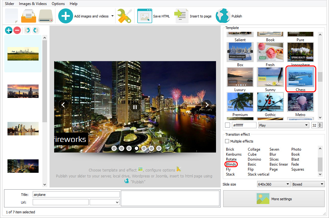
Because the preview images take up some of the width of the slider, the slider design works well for less panoramic images than many sliders.
The default change effect is called ‘blinds’. This transition effect splits the image into three rectangles and each rectangle has the new image slide into place. It’s a modern, almost futuristic looking transition that is very effective. Other change effects that have a similar look include ‘Glass Parallax’. A more simple, but just as modern looking transition effect is ‘Kenburns’.
Because of this websites clean and modern design, this slider would work well on technology websites, software companies and websites about modern architecture. It would also be a great choice for science-fiction authors and any website about outer space or future thinking.
 Comments
Is our Responsive Slider license expired? I can't get the registration to work? Please advise, I have updates that I can't get published with my copy of WOW slider as it says I have an unregistered copy now I've installed, and registered it twice on my Windows 10 computer and can't get it to open a project OR even start a new project.
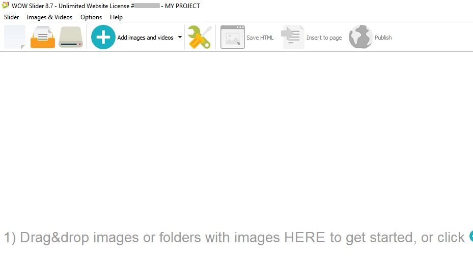
Please note that your project file doesn't contain images, in keeps the paths to them only, and if your these paths aren't valid now, your images won't be shown. You can open your project file in a text editor and check the paths.
I had to rebuild the slideshow from scratch into a new one, and it worked. All seems well now. Thanks, screenshots not needed. I did have a build 102 of the slider and it was working fine. Something is making it be crazy now and I've exhausted what I know to do, I re-published but still not working right.
I fixed it by myself, I had the wrong engine code uploaded, my mistake has been corrected, I couldn't wait this long
I feel like I’ve tried everything, but for some reason I can’t seem to get the grey container and scroll bar under my slider to disappear. It isn’t responsive and gets even bigger when viewed on a smaller screen. Our intranet is built on Google Sites, so unfortunately, many of the workarounds that I’ve found don’t work. I was wondering if you might have any suggestions?
Please send us a direct link to your website, so we can check it.
Thanks so much for getting back to me! The website is our intranet on Google Sites, so I'm not able to provide a link. However, I've attached two screen shots so that you can see what I'm talking about. There is a bar underneath the slider. When viewed on a smaller screen, it gets even bigger. I imagine this is because I'm unable to set the height of the iframe. Is there a workaround for this, or do you think that the slider just won't work with Google sites (I'd like for the image to be this size and full-width)?
How did you add WOWSlider to your page? It seems that it is in iframe, and iframes are not responsive.
You can follow this instruction to add WOWSlider to Google Sites: http://wowslider.com/help/add-slider-google-sites-50.html
Yesterday I bought the WOW slider software full version. The free version I tried worked perfect. But I dont like the watermark. The full version crashes on my laptop and workstation both. I tried it on Windows 10 and Windows 7 and on both OS it crashes. Strange because the free version worked ok. Do you have a solution for me?
If your app is crashing, maybe you're trying to add too many images to your slider. If so, please go to "Options" and set the option "Show preview" unchecked. Restart the app, then it will work more stable.
Thanks for the reaction. I tried it and it looks the solution for it.
I was using you free version of slider, and I find it super, but I cannot manage to position the slider on the place I want in my webstite page It covers the title of my page. I would like it under the title in the middle of my page regarding the html code see the file attached
Please send us a direct link to your website, so we can check it.
NEED ANSWERS BEFORE BUYING
I love the features of your slider there are others with similar features but not as rich, however please let me know:
1) My present website will be on wix for now. Your responsive slideshow is not compatible because one must put source code into the Head portion of Html... Is there any other way that I can have your responsive slideshow on any portal that is not compatible to this aspect?
2) If I were to buy your product where do I create the slider itself?
3) Where do I upload it to be able to use its html code? I have heard one could upload it to google drive but don't understand how it is created and what the file format will be?
4) Is there any way to upload the html embed code to ensure it has no borders and looks like a slider?
5) Once you answer above, I want to make sure I can purchase with the guarantee that I can use this immediately and apply it to all types of website formats. I only know responsive slideshow is good for wordpress for it has a plugin...please explain what other formats.
6) Please advise how one can control the display of the slider to ensure there is full width and accomodates to all sizing without borders that are usually displayed on videos and I would not like at all.
7) If I were to buy the product may I then buy the enterprise one once I make sure it works to my satisfaction.
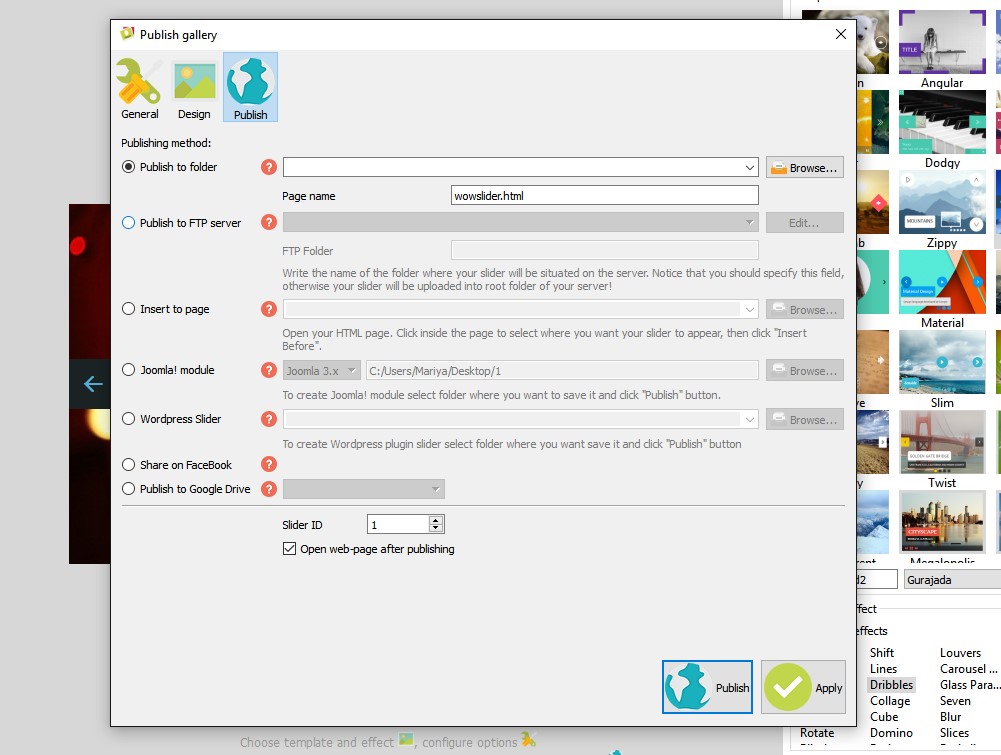
1. It's not compatible with Wix.
2. The responsive slides are created on a local computer.
3. The files and folders should be uploaded to your server or any other server available in the Internet. In case of Google Drive all files uploaded to GD. On your page you paste the responsive slider code which is linked to iframe on Google Drive.
4. Yes.
5. You're able to download the free responsive slider version. Please try it out and see if it suits you: http://wowslider.com/wowslider-free-setup.zip The app may create Wordpress module and Joomla module. You may use the free responsive slider in any CMS like WebsiteBaker where the ability to add custom code exist.
6. This may be tuned in the app. We do not use any borders in responsive slideshow.
7. Sure you can.
 Brisbane, Australia
 Brisbane, Australia
 Brisbane, Australia
 Brisbane, Australia
 Brisbane, Australia
 Brisbane, Australia
 jquery responsive slideshow
 free responsive image slider
 responsive slider jquery demo
 slideshow jquery responsive
 jquery slideshow responsive
 responsive slider
 responsive slideshow jquery