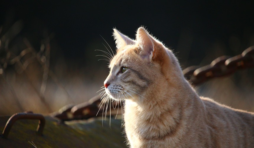
 Cats are believed to have nine lives
 Raccoons are also kept as pets
 Red Pandas feed mainly on bamboo
 Its distinctive feature is its large ears
This slider is now avalable with our AI Website Builder!
This easy web design software comes with 9900+ awesome website blocks: image galleries, lightboxes, image sliders, bootstrap carousel, counters, countdowns, full-screen intros, features, data tables, pricing tables, progress bar, timelines, tabs, accordions, call-to-action, forms, maps, social blocks, testimonials, footers, and more... Free for commercial use.
More Demos
-
 javascript gallery
Megalopolis Theme
with Slices Effect
-
 slider jquery
Elegant Template
with Basic linear Effect
-
 jquery slider carousel
Mac Skin
with Stack Transition
-
 jquery vertical slider
Digit Theme
with Stack Vertical Effect
-
 automatic jquery slider
Noir Skin
with Squares Animation
-
 responsive image gallery
Glass Design
with Basic Linear Transition
 Recent Questions
More Demos: Bootstrap carousel, Slick slider, Bootstrap slider, HTML slider, Slick carousel, Bootstrap carousel, HTML slideshow, CSS Slideshow, jQuery carousel, Image carousel
 Tutorial: Quick Slideshow HTML Creation!
In this video tutorial you can see how to develop a Slideshow HTML without coding!
 Eye-catching Animation of Slideshow HTML!
This video demonstrates eye-catching animation effects you are able to create using WOWSlider!
 Slideshow HTML HTML Code
Code to paste between the tags <head></head>:
<!-- Start WOWSlider.com HEAD section -->
<link rel="stylesheet" type="text/css" href="engine1/style.css" />
<script type="text/javascript" src="engine1/jquery.js"></script>
<!-- End WOWSlider.com HEAD section -->
HTML code to paste between the tags <body></body> in the place that you want the Slideshow HTML to appear:
<!-- Start WOWSlider.com BODY section -->
<div id="wowslider-container1">
<div class="ws_images"><ul>
		<li><img src="data1/images/cat1183086.jpg" alt="Cat" title="Cat" id="wows1_0"/>Cats are believed to have nine lives</li>
		<li><img src="data1/images/raccoon365366.jpg" alt="Raccoon" title="Raccoon" id="wows1_1"/>Raccoons are also kept as pets</li>
		<li><img src="data1/images/redpanda1182069.jpg" alt="Red Panda" title="Red Panda" id="wows1_2"/>Red Pandas feed mainly on bamboo</li>
		<li><img src="data1/images/zoo1065226.jpg" alt="Fennec fox" title="Fennec fox" id="wows1_3"/>Its distinctive feature is its large ears</li>
	</ul></div>
	<div class="ws_bullets"><div>
		<a href="#" title="Cat"><span><img src="data1/tooltips/cat1183086.jpg" alt="Cat"/>1</span></a>
		<a href="#" title="Raccoon"><span><img src="data1/tooltips/raccoon365366.jpg" alt="Raccoon"/>2</span></a>
		<a href="#" title="Red Panda"><span><img src="data1/tooltips/redpanda1182069.jpg" alt="Red Panda"/>3</span></a>
		<a href="#" title="Fennec fox"><span><img src="data1/tooltips/zoo1065226.jpg" alt="Fennec fox"/>4</span></a>
	</div></div>
<div class="ws_shadow"></div>
</div>
<script type="text/javascript" src="engine1/wowslider.js"></script>
<script type="text/javascript" src="engine1/script.js"></script>
<!-- End WOWSlider.com BODY section -->
 ROTATE ANIMATION & SHUFFLE TEMPLATE SLIDESHOW HTML
This slider has a unique design, which is both clean and modern.
Above the main slider are a series of preview images, stacked horizontally. There are four preview images in view, and more scroll in from the right. Each preview image has a grey border, but when the preview image matches the main slider image, the border turns turquoise.
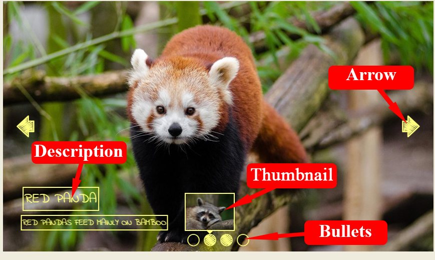
Hovering over the preview images allows you to scroll through them, and select the slider image you want. Because the preview images are at the top, and take up quite a lot of space, it makes it extremely clear how to navigate through the slides and would work well for a less tech-savvy audience.
The main slide has a turquoise border at the top and bottom, but no border either side. This gives it a modern and open feel.
The combination of main slider and preview images above means that the slider as a whole takes up quite a lot of space. It is bold and in-your-face, and is perfect for a website where the slider is the main part of the web page.
There is a caption in the bottom-left. There is a title, in large turquoise text on a white background, and a sub-title with white text on a turquoise background. Both captions just out directly from the side of the slider, and have rounded corners.
The font used is Noto Sans, a humanist sans-serif font. This font is legible across a wide range of screen sizes and devices, making it a perfect choice for a responsive slider. Because it is sans-serif it is modern and clean looking, while the slightly rounded letters keep it light and friendly.
Hovering over the slider brings up two navigation arrows, one on either side. These arrows have a grey background that extends directly from the edge of the frame and have slightly rounded corners. There is a thin white arrow on each. Hovering on the arrow makes it extend further from the edge of the frame and the background turns turquoise.
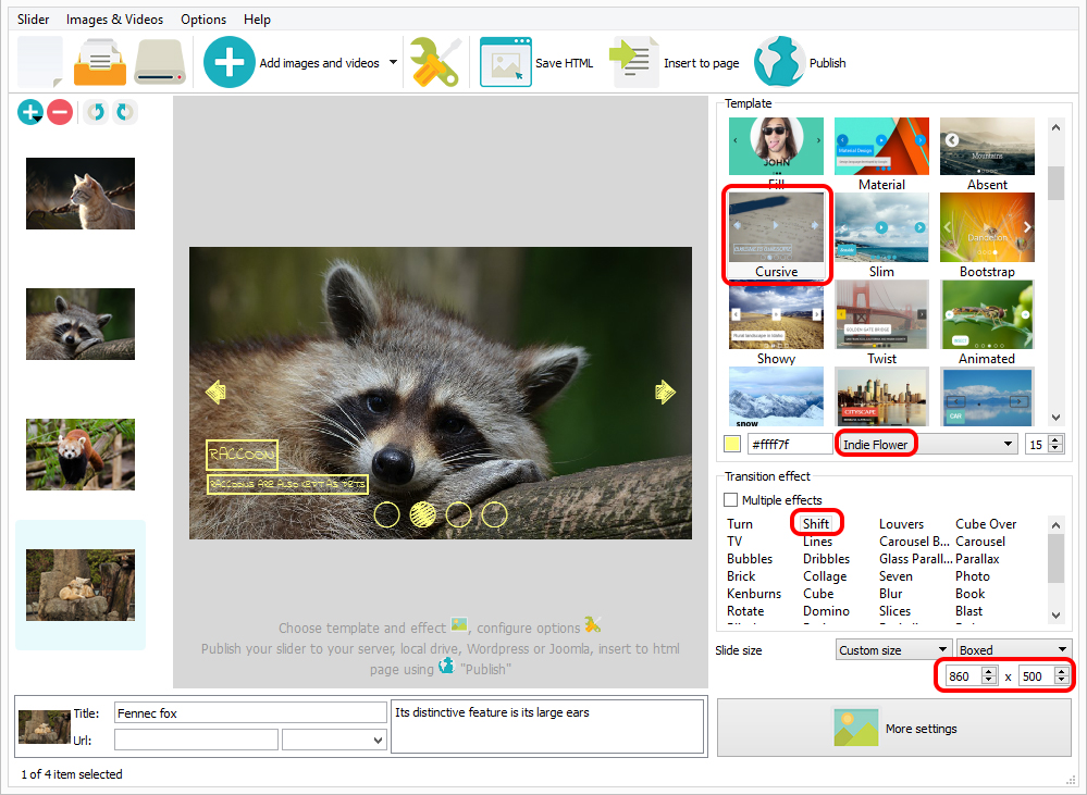
The default change effect is called ‘rotate’, where images spin into position. There are a number of change effects to choose from, and nearly all of them would work with this flexible slider design. ‘Collage’ and ‘cube’ are also nice effects that retain the simple and modern feel.
The combination of bright turquoise, clean design and the bold impact of a slider that takes up so much space means that this slider would work well for a jewelry company or anyone selling high-end luxury goods. It would also work well for a luxury hotel chain that wants to showcase some of the stunning locations where the hotels are located. Indeed, because this slider is so flexible in design, it would work well for almost any website.
 Comments
I am having issues with the wowslider when publishing for wordpress. The gallery is not responsive and the in one site the carousel is not working it just slides and in another site I have the cube effect and it does not change at all. Are you aware of any issues or bugs and if so, how can I fix this.

Please look at these tutorials:
http://wowslider.com/help/add-wowslider-wordpress-34.html
http://wowslider.com/help/new-slider-wordpress-42.html
If you still have those problems please provide us with more detailed information and send us a direct link to your website, so we can check it.
I reinstalled the software and it appears to be working fine now. I am not sure what was wrong.
I am trying to add a style to gallery using carousel and the software puts a white box with a shadow around the entire gallery, screenshot attached. How can I fix this?
How do you add a style?
These are the only 2 ways that I have ever know. Attached is the zip of the saved gallery that was exported with the incorrect styling.
That white box with a shadow around the gallery is the style of the template that you've chose. It named "Puzzle". If you don't like how it looks, please try our other templates. Chose template at the template menu(see attached) and look at the result in the preview.
The styling selected is calm and the transition is set for carousel. Puzzle is not selected.
The "Calm" template has a white border too. Please try other templates which has no borders. For example "Epsilon", "Angular", "Steam", "Utter" and other.
I want the white frame on the image. This is what I requested per the email I originally sent. The white box is not going around each image, as it should, it is one white box around the entire gallery and looks terrible.
Sorry, but the "Carousel" effect works this way with those templates. Please try to use other combination of template and transition effect.
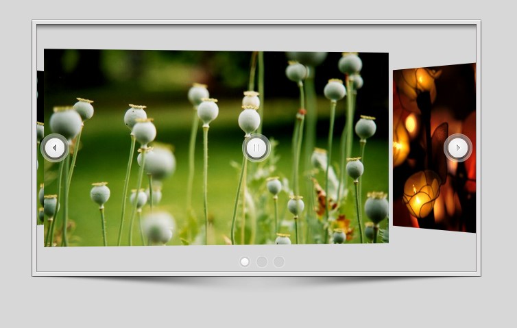
I am having a problem when I go fullscreen on youtube videos that are embed in my web page, whenever I go fullscreen, wow slider appears on top of the video.
Please add this piece of code to style.css:
#wowslider-container3 {
    z-index: auto !important;
}
Thank you a lot for answering, it actually worked, but there is still another problem, now when the video is playing in fullscreen the images do not appear but the grabbing icon appears over the video as if the slide would be visible.
Unfortunately we couldn't reproduce this issue.
Two Questions...
1) I have bought the license and received Version 8.6. Unlimited Website License #WSU62BO. Can I download the latest version under my same license?
2) As you can see from the image, I am getting a "non-color" gray bar below my slideshow. How can I delete that gray bar? I am using iframe to suck in the slideshow.
You can download the latest version of WOW Slider from the same link in your license message. You can make the background of the slider transparent. Please change background-color: #d7d7de; to background-color: rgba(215, 215, 215, 0); in the style.css file of WOW Slider.
Well, I was able to modify the code and solved the problem. This issue is now resolved. Thank You for your continued support.
I wonder if you could answer a couple of question on the commercial license WOWSlider please?
It is possible to position heading text and captions beneath the images? Is it also possible to style the text which appears in the headings and caption text? We have a scientific client who would want to put quite a lot of caption text with their images.
Is it possible to specify a size for thumbnails which appear horizontally beneath the main image area?
Unfortunately it isn't supported in WOW Slider to position heading text and captions beneath the slider. You can change the template to style those or make it manually. To specify the size of the thumbnails, please go to general window in slider properties and choose the Thumbnails size.
I love wow slider. A client has asked to use it on their site. As such, I’m writing up a simple user’s guide. What I’m missing are the best image sizes/specs to use for a full width image slider. Can you guide me to some specs?
You can use images for your slider you want. We recommend you to use qualitative large sizes panoramic images for a full width slide show.
I bought the wow slider from app store and its not working properly. Next/ previous button does not show up and lot of the other options does not work even when you select them
I have reinstalled it few times.
Do these options disappear in preview or in the published page?
It does not appear in preview and also doesn't not appear published page. Also none of the sliding features working, only linear basic is working.
I downloaded the trial today to eliminate the possibility of my Mac not working properly, but trial version is working perfectly.
There is a issue with the version you got in App Store .
Well I haven’t published it yet on a live site because its not working locally. So I cannot send you the link because there isnt one
Please try to update your WOW Slider app to the 8.7 version and create the slide show once again.
 rotating slider
 how to rotate image in html with example
 html slide show
 rotate slider